Log in
Build Your Site
What Are Monochromatic Colors? A Design Guide
Unlock the power of monochromatic colors in your next design. Learn what they are, how to use them, and how to build stunning websites with Wegic’s AI builder.
Imagine scrolling through a sleek portfolio site where every shade, from the softest gray to the boldest black, comes from the same color family. It feels clean, modern, and calming. That’s the quiet power of monochromatic colors, and in 2025, they’re everywhere.
From websites and branding to fashion and product packaging, monochromatic palettes are staging a stylish comeback. Designers and creators are embracing this look not just for aesthetics, but for its ease, harmony, and flexibility. It’s minimal without being boring, bold without being chaotic. Whether you’re building a brand or curating your closet, sticking to one hue (and its tints and shades) makes choices simpler, and outcomes more stunning.
In web design, monochromatic color palettes help highlight content, improve focus, and create a strong emotional tone. In fashion, think of monochromatic color clothes: an all-beige look feels effortlessly luxurious, while head-to-toe red is high-impact and confident. Even social media feeds are trending toward tonal aesthetics, a single color story across images boosts engagement and adds polish.
A good monochromatic color example? A wellness brand using a full range of soft blues, sky blue, slate, navy, to create a calming, trust-building experience. It’s simple, but speaks volumes.
Minimal, bold, and effortlessly chic, monochromatic color palettes are redefining modern design. Whether you're designing a landing page, branding a product, or planning your next outfit, one hue is all you need to stand out.
What Are Monochromatic Colors? (The Basics)
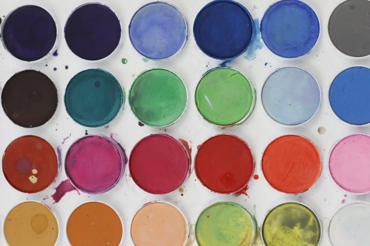
At its core, a monochromatic color palette uses only one hue, but expands it through tints (adding white), shades (adding black), and tones (adding gray). This method allows designers to create a harmonious and unified look using just one base color.
Think of it like playing with the volume knob on a speaker: you’re not changing the song (your base hue), you’re just adjusting how loudly or softly it plays. That’s how monochromatic colors work, they let you shift intensity without changing the identity of the design.
To picture this in action, imagine a blue monochrome palette:
-
Light sky blue (tint)
-
True blue (base hue)
-
Slate blue (tone)
-
Deep navy (shade)
Here’s a helpful visual example:
Insert image or color wheel showing base blue with its full monochromatic range.
Is Black-and-White a Monochromatic Palette?
Technically, no. Black and white together form a grayscale palette, which is achromatic (without hue). A true monochromatic color example would be a palette based on a single color, such as red, green, or teal, plus its variations. So while black-and-white looks minimal, it doesn’t qualify as a monochromatic color scheme in the design sense.
Why Use Monochromatic Colors in Design?
Designers, developers, and even fashion stylists love monochromatic colors for one simple reason: they work.

1. Visual Consistency
Using a single hue across an entire design or outfit helps avoid clashing colors and creates a unified, polished appearance. In web design, this ensures that every section flows smoothly and feels intentional.
2. Emotional Focus
Color carries emotion. A full palette built from forest green can feel grounded and trustworthy, while a monochrome of lavender evokes calm and sophistication. The lack of multiple hues helps the viewer stay emotionally anchored in the intended mood.
3. Great for Accessibility
With careful use of tints and shades, you can create strong contrast even within a single hue. That means cleaner visuals for all users and easier compliance with WCAG accessibility guidelines, a must for modern websites.
4. Easy to Manage
Using monochromatic colors simplifies the design process, especially for solopreneurs or creators building their own sites. Whether you’re designing a brand identity or selecting UI elements, having one dominant hue means fewer decisions and faster output.
monochromatic color examples:
-
Apple frequently uses space gray or white-based monochromes in packaging and product imagery.
-
Pinterest has experimented with monochrome-themed boards and interfaces.
-
Architecture & Art Galleries often use monochromatic colors to let form, texture, and light become the focus.
-
In fashion, monochromatic color clothes like an all-black look or beige-toned outfit are both timeless and powerful.
Whether online or in real life, the right monochromatic color example creates instant coherence and lasting impact.
How to Build a Monochromatic Color Palette
Creating your own monochromatic color palette doesn’t require a design degree. Follow these simple steps to develop a clean and modern scheme using just one hue.
Step 1: Pick a Base Hue
Start with a color that aligns with your brand, vibe, or personality. Want something calm? Go for blue or green. Want energy? Red or orange could work.
Step 2: Generate Tints, Shades & Tones
Now modify your hue:
-
Add white for tints (soft, airy feels)
-
Add black for shades (bold and dramatic)
-
Add gray for tones (balanced and muted)
These subtle shifts help you build contrast and visual hierarchy without introducing other colors.
Step 3: Balance Your Contrast
Make sure your design still feels readable and accessible. Place lighter tints behind dark text, and vice versa. Aim for balance so key sections stand out.
Best Coloring Tools
Wegic uses AI to instantly create monochromatic websites. Just pick a base color, and Wegic auto-generates a harmonious theme with ideal tints, shades, and font contrasts, all responsive design and SEO-friendly.

-
Adobe Color
Great for exploring color families.
-
Coolors
Quick palette generation with contrast checks.
Pro Tip:
Avoid a “flat” look by adding texture, gradients, or soft animations when you use Wegic. A simple hover effect or scroll transition can add depth without disrupting the monochrome harmony.
Done right, monochrome is never boring, it’s bold, focused, and striking. And with tools like Wegic, creating a professional monochromatic color layout is easier than ever.
Common Mistakes to Avoid with Monochromatic Schemes
Even though monochromatic colors are known for their simplicity and elegance, they still require thoughtful execution. Without careful planning, your design might feel flat, confusing, or hard to use. Here are the most common pitfalls, and how to avoid them.
1. Not Enough Contrast
One of the biggest mistakes in using monochromatic colors is not building enough contrast between elements. When all your shades and tints are too similar, headlines can disappear, buttons blend in, and overall usability suffers. Especially in web design, text that lacks contrast against its background fails both visually and in terms of accessibility.
For example, in a monochromatic color example using pale yellow, avoid pairing soft beige text with a light lemon background. The result may look cohesive, but will be unreadable to many users. The solution? Vary the brightness and saturation thoughtfully and test contrast ratios using tools like WebAIM or Wegic’s built-in color checker.
2. Overusing a Single Tone
Yes, you’re working within one hue, but that doesn’t mean you should stick to just one tone throughout the design. Overusing a single value (like only dark green or only pastel pink) makes the design feel flat and one-dimensional.
Instead, a strong monochromatic color example balances highlights and shadows, layering tints and shades to add depth and direction. Think of it as storytelling with light and color, even within one hue, there should be a journey.
3. Forgetting Accessibility (WCAG Contrast Ratio)
Your design might look nice on a high-end monitor, but what about on a smartphone in daylight? Accessibility is often overlooked in monochromatic colors design, especially when creators are focused purely on aesthetics.
Make sure that every interactive element, links, CTAs, input fields, passes contrast standards. Wegic automatically checks WCAG 2.1 contrast ratios and offers smarter alternatives if your palette doesn’t meet them.
4. Too Minimal
There’s a fine line between “clean” and “sterile.” Sometimes, designers rely too heavily on minimalism and forget that users still crave visual interest. If your layout lacks focal points, textures, or movement, a monochromatic color example can quickly become forgettable.
This is where layout choices, subtle animation, or texture come in. Use them to guide the user’s eye and bring a sense of sophistication, without disrupting the harmony of your color scheme.
Build a Stunning Monochromatic Website with Wegic
Designing with monochromatic colors doesn’t have to be intimidating. In fact, it can be incredibly fun and fast, especially when you’re using Wegic, a conversational AI website builder that turns your creative ideas into fully functional websites in minutes.
Wegic makes building a monochromatic color example as easy as chatting. You just tell it what base color you want to use (like navy, coral, or forest green), and Wegic takes it from there, generating the ideal mix of tints, shades, and tones for your pages.
Highlighting Features:
Here’s what makes Wegic perfect for monochrome design:
One-Click Monochromatic Palette Setup
Just say the word, literally. Tell Wegic, “I want a light green monochromatic site,” and it builds the color scheme automatically across your layout. It adjusts backgrounds, headers, and buttons using the full range of your chosen hue.
Smart Contrast Suggestions for UX & Accessibility
Wegic doesn’t just pick pretty colors, it ensures they work. Every monochromatic colors choice is run through accessibility checks, and the AI recommends high-contrast pairings to make sure your design looks great and reads easily.
AI Suggestions for Layout, Typography, and Animations
Need your text to pop more? Want subtle animation on scroll? Wegic understands your color direction and proposes complementary design decisions that elevate your monochromatic color example, like a soft fade-in animation on sections with dark tones, or oversized serif fonts to balance light shades.
Try Wegic now and launch your monochrome masterpiece in just one minute. Whether you’re building a portfolio, a product page, or a blog, Wegic gives you the tools, and color intelligence, to make your single-hue site stand out.
Bonus Tips for Making Your Monochrome Design Pop Using Wegic
A standout monochromatic color example is about bringing that palette to life with creativity, depth, and interaction. Wegic gives you everything you need, from texture tools to animations, all without code.
Add Texture with Drawing and Markup Tools
Flat backgrounds often feel sterile, but with Wegic's “circle modification” and freehand markup features, you can visually highlight sections and tell the AI exactly where to add textured overlays (like linen, paper grain, or noise).
Layer Gradients and Shadows via Conversational Commands
Want to visually enhance hierarchy? Simply type: “Add a vertical gradient from pale blush to deep rose on the header,” or “Apply soft shadow to buttons.” Wegic interprets and updates your site design to introduce natural movement and depth, elevating your monochromatic color example with elegance.
Integrate Micro‑Interactions & Scrolling Effects
Interaction breathes life into flat designs. With Wegic, you can ask for interactive behaviors:
-
“Enlarge button by 1.2× on hover”
-
“Slide in text blocks from left on scroll.”
Want to push the envelope? Wegic supports web animations, including hover-triggered 3D transforms. For example:
“Add a 3D rotation effect to product thumbnails on hover.”
This approach adds sophistication and polish to your monochromatic color example, making it feel futuristic yet cohesive.
Why These Tips Work with Wegic
-
No coding required: All texture, gradient, or interaction styles are applied instantly, without writing CSS or JavaScript, just speak your design vision.
-
Instant visual feedback: Wegic previews changes live, letting you fine-tune until your monochromatic color example looks perfect.
-
Consistency across your hue: Because everything remains within the same color family, your design retains its minimalist harmony while gaining visual richness and user engagement.
In minutes, your monochromatic website turns from static to interactive, polished, and dynamic, a true monochromatic color example that pops.
With Wegic’s advanced yet intuitive toolkit, your monochrome design becomes anything but minimal. It’s layered, vibrant, and engaging, visually unified yet dynamically alive. Try it today and discover how effortless powerful design can be.
Conclusion: Simplicity Meets Impact
In a world full of visual noise, monochromatic colors offer a refreshing return to clarity, elegance, and emotional impact. Whether you're designing a website, brand identity, or fashion line, sticking to one hue and its variations brings instant cohesion and ease. It’s a timeless strategy embraced by leading brands for a reason, it works beautifully across mediums, simplifies decision-making, and delivers striking results with minimal effort.
With Wegic, turning a simple color concept into a stunning digital experience is just a conversation away. From smart palette generation to interactive design tweaks, Wegic empowers creators of all levels to confidently bring their ideas to life. Start creating with color confidence, Wegic makes it effortless.
Written by
Kimmy
Published on
Jun 17, 2025
Share article
Read more
Our latest blog
Webpages in a minute, powered by Wegic!
With Wegic, transform your needs into stunning, functional websites with advanced AI
Free trial with Wegic, build your site in a click!