Log in
Build Your Site
Design Like a Pro: 10 Landing Page Best Practices for 2025
Explore 10 amazing landing page best practices for 2025 that help you design like a pro, improve performance, and increase engagement with proven techniques.
How is your day, my fellow web designers? Ever stare at a presentation with a confused look on your face and wonder why their digital efforts feel more such as grass rolling on the ground than an oasis of conversions? This frustrating situation seems to me just like yesterday. Many people make a mistake right out of the gate and confuse the main entrance to their website (the homepage) with the precise conversion tool, the landing page. Let me tell you, understanding this difference is the first and most critical golden rule in landing page best practices for business. Just thinking about designing a landing page framework that can get a high conversion rate makes me sweat nervously, but there is no need to be so scared! We’ll soon embark on a journey that will take you from design novice to landing page expert. Stop looking at those boring and hypnotic pages!
Now let’s talk about the top ten landing page practices in 2025 that will enhance your conversion rate. Get ready to discover actionable tips for landing pages that will have your visitors clicking "yes" faster than you can say "conversion optimisation."
What is a Landing Page
A landing page is called by different names among people, and these names are generally related to their specific uses. These contain “lead capture pages,” which are initially used to capture visitor data; “squeeze pages,” which are designed to encourage people to submit information; “destination pages,” which serve as the destination for marketing links; and “single property pages,” which underscore their own independence. Whatever you call it, a good landing page generally has three things: a paragraph that speaks to the hearts of visitors and makes them feel that this is what they want; a valuable offer that incentivises the desired action; and a simple call to action that allows them to take action immediately. The various names for web pages, such as landing pages, especially "squeeze page" and "lead capture page", clearly imply that their core function is to collect visitor information. Therefore, the design and content of your landing page should prioritise making the exchange feel beneficial and smooth to the user. It is very critical to come up with a statement that is particularly touching, so that people are willing to leave their information. Moreover, the design should make the process smoother and avoid a lot of trouble.
Landing Pages Vs. Homepages: What's the Difference
There is still a debate about which is more critical, the landing page or the homepage. While they are all web pages, their actual uses are completely different.
-
Homepage: Treat your home page as your most critical place on the Internet. Its purpose is to give visitors a warm welcome, let everyone see the overall image of the brand, take them to various parts of the website, and also meet the interests of different groups of people. It is generally not optimised specifically for a single conversion goal.
-
Landing Page: Compared with ordinary pages, a landing page is an independent and specialised page whose only design goal is to convert visitors into customers. This conversion can be anything from collecting email addresses to generating leads, or even directly making a sale. Due to this focus, landing page best practices enhance clarity, simplicity, and a vigorous call to action. A well-designed landing page not only works perfectly with marketing promotions but also brings measurable results, which is completely in line with the regulatory practice of commercial landing pages.
Wondering about web examples for inspiration? Check the posts below:
Inspirational Landing Page Examples for Business
Drawing inspiration from successful landing pages can provide valuable insights into effective design and content strategies. Here are ten examples of landing pages from various businesses that display landing page best practices for achieving high conversion rates:
1. HubSpot
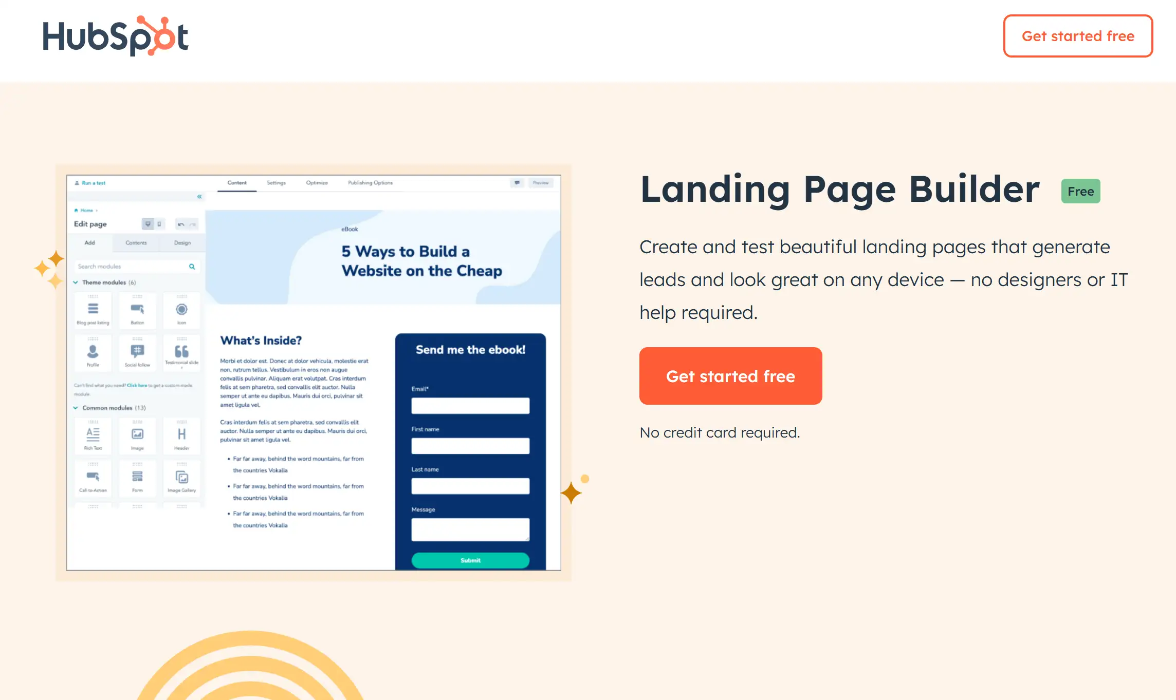
This landing page effectively communicates its core offering immediately with the headline "Free CRM Software." It makes good use of white space and reiterates its unique selling proposition in the call to action.
2. Shopify
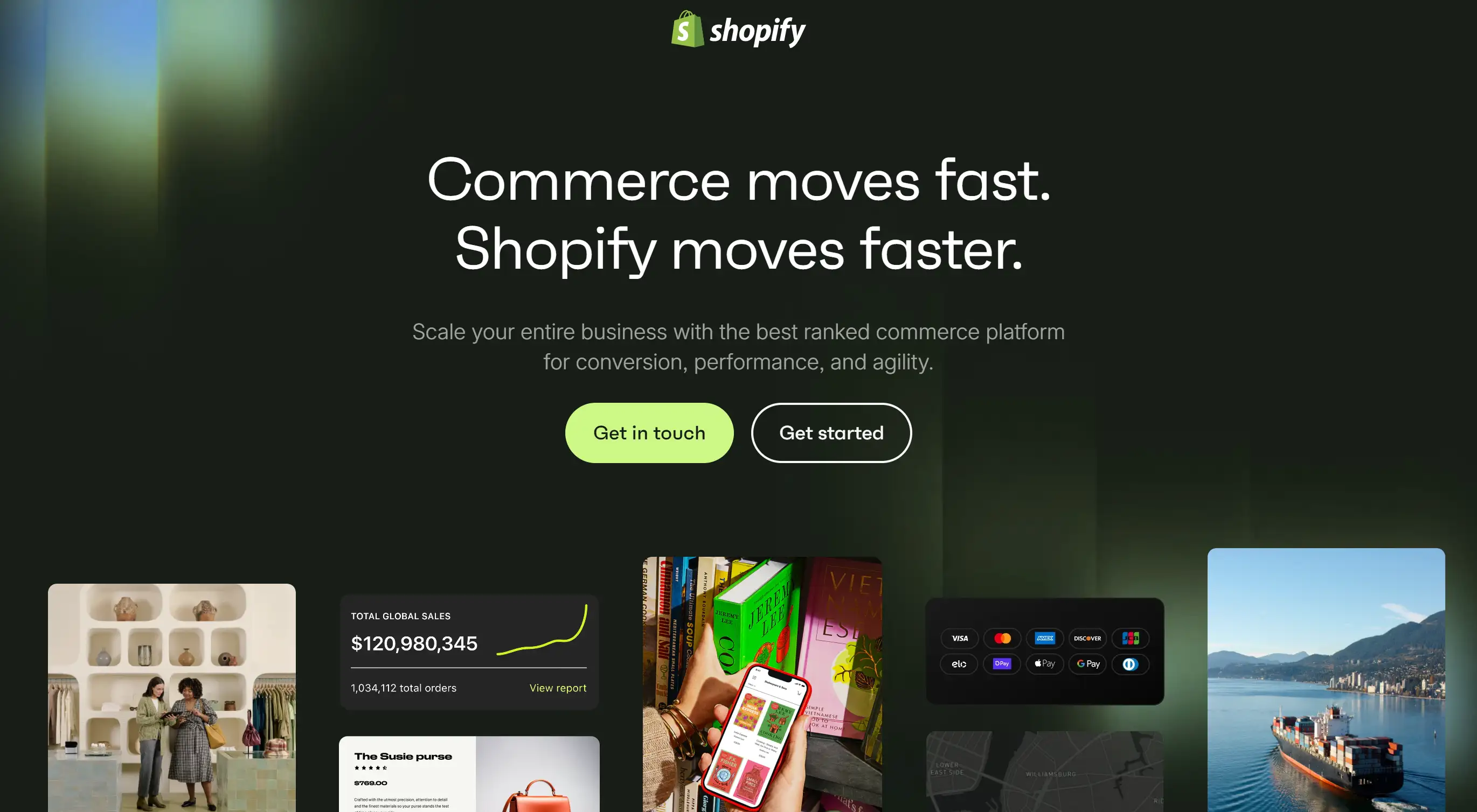
Shopify’s landing page is particularly vivid and interesting, and it looks attractive. It well demonstrates that this platform can adapt to the needs of various types of businesses. It uses an obvious call to action, “Start your free trial”, and highlights the benefits of creating an online store.
3. Squarespace
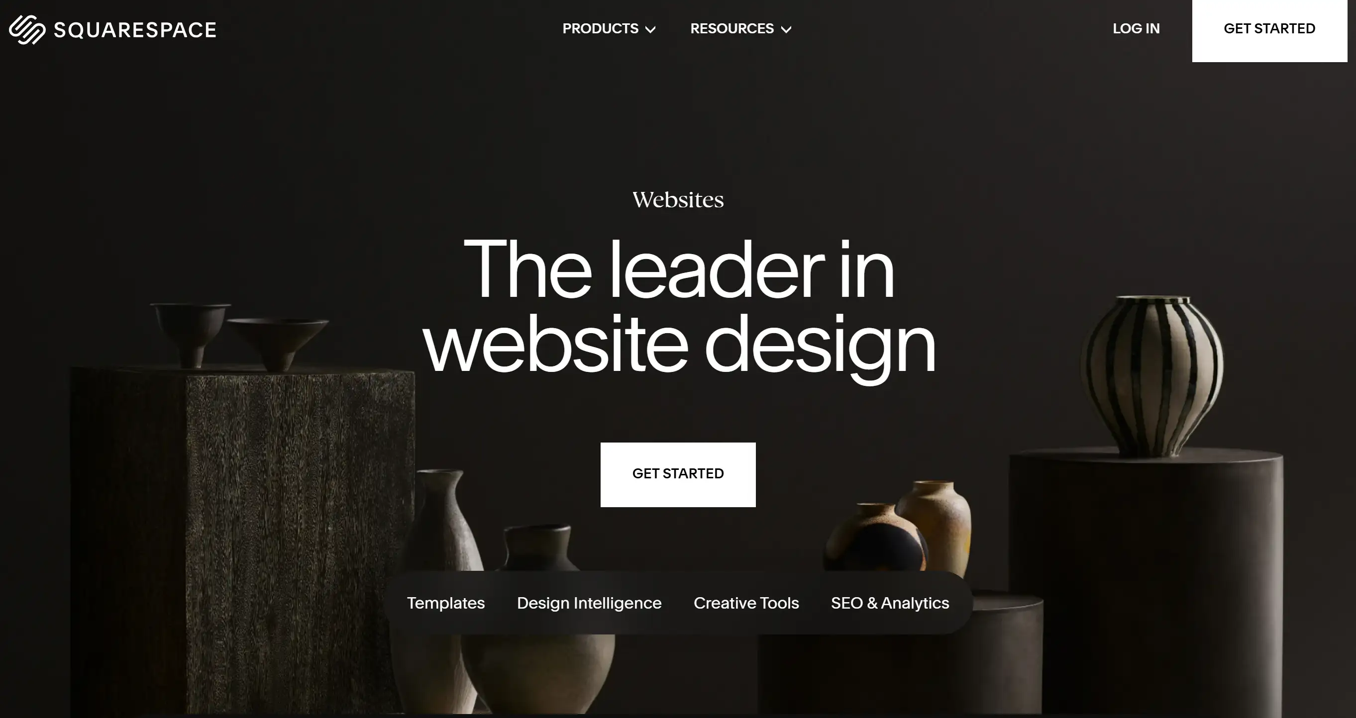
Squarespace’s landing page is particularly effective, with a simple header and scrolling background image that showcases the amazing sites users can create. To put it simply, the call to action is to just “start”!
4. ActiveCampaign
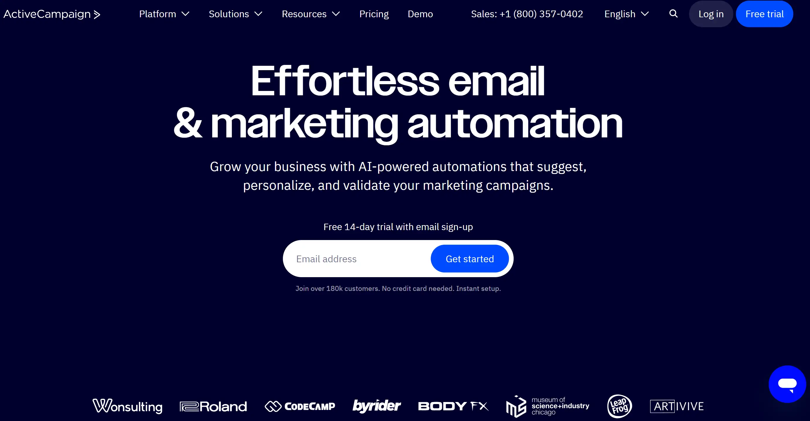
The main purpose of this B2B landing page is to help visitors solve problems by accurately contacting the target group via customised emails. It uses a catchy headline and a simple form that allows users to start their free trial right away.
5. Unbounce
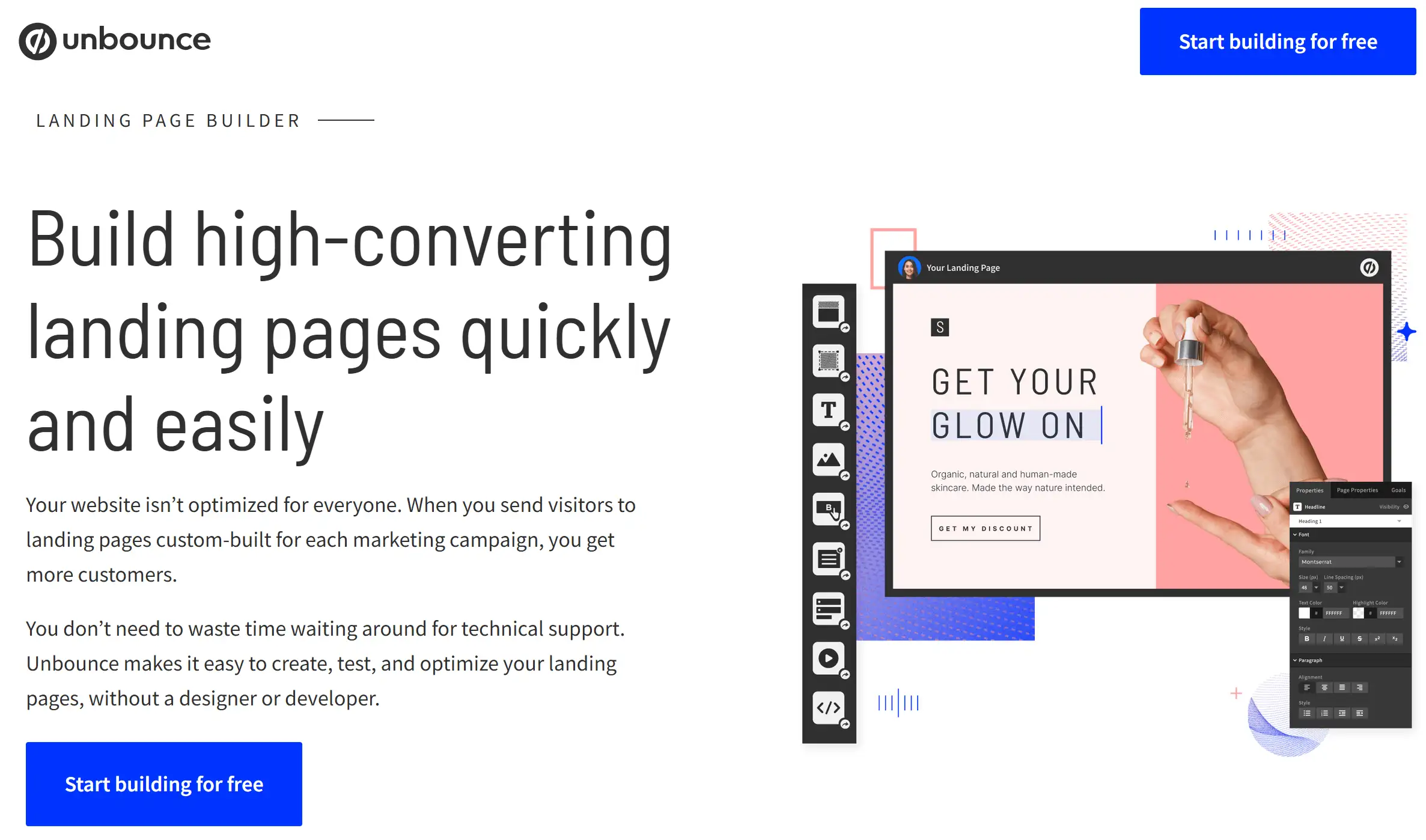
Unbounce’s landing page guide has a clean layout without any unnecessary clutter. It brings valuable information and also positions Unbounce as a reliable authority in this field.
6. Wistia
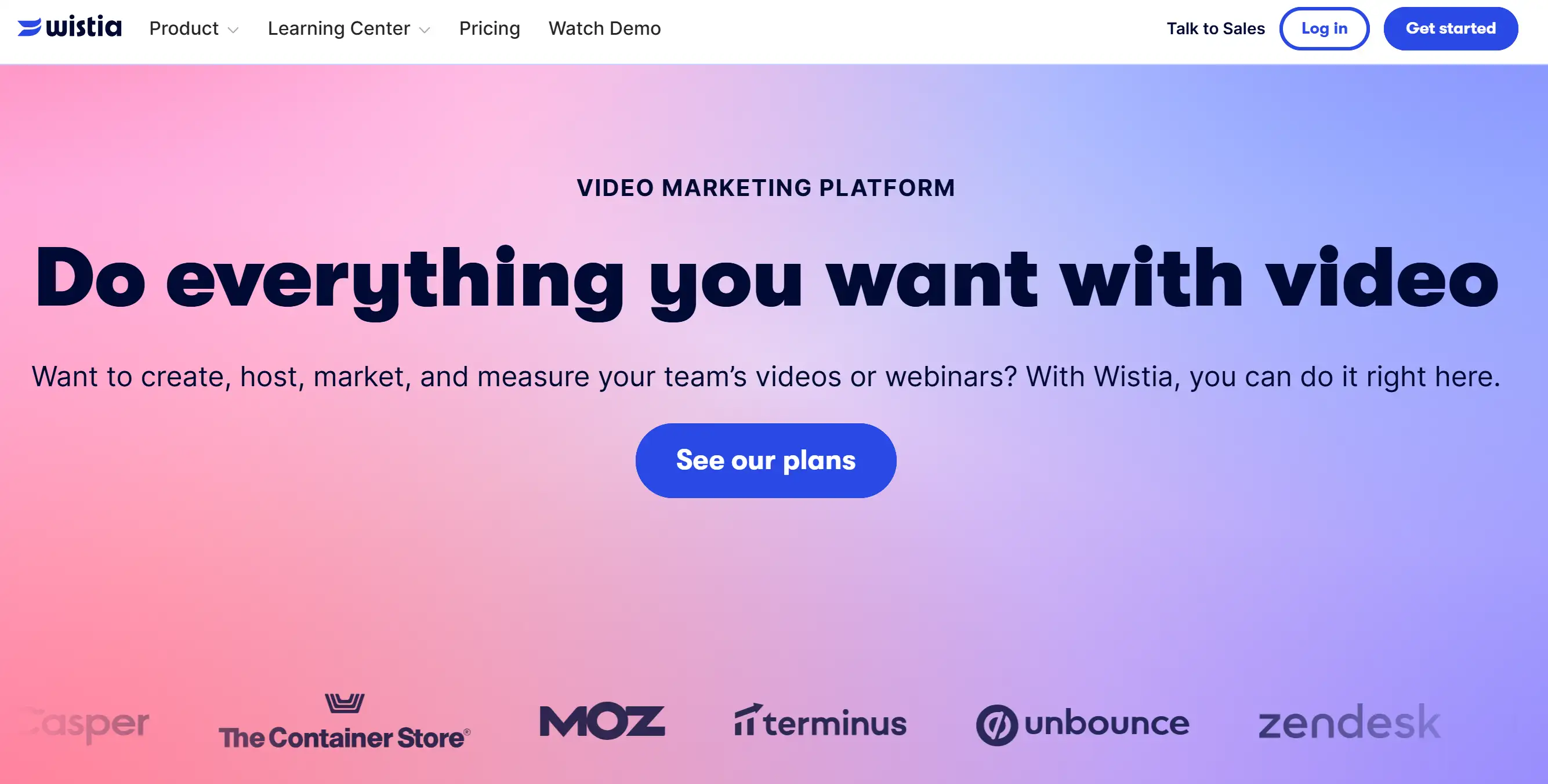
Wistia’s landing page makes great use of visual elements, combining video and graphics to showcase its features. The registration form is simple to fill out, and users can quickly get a free account.
7. DoorDash
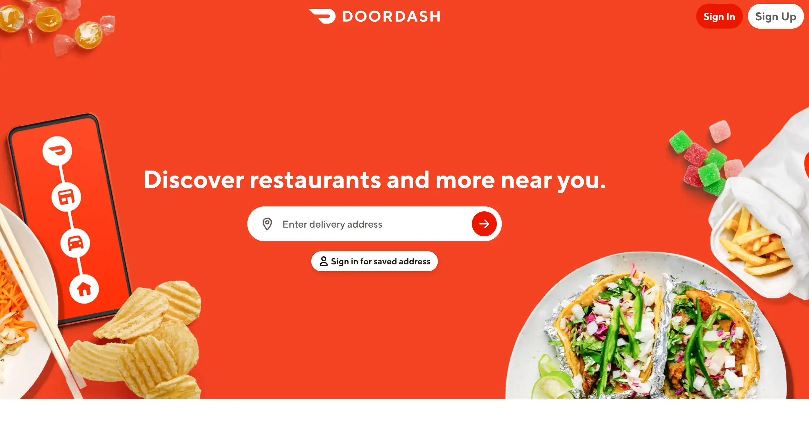
DoorDash's landing page for recruiting drivers emphasises the autonomy and flexibility of being a Dasher. It has an easy-to-see search box that makes it easy to find opportunities nearby.
8. Airbnb
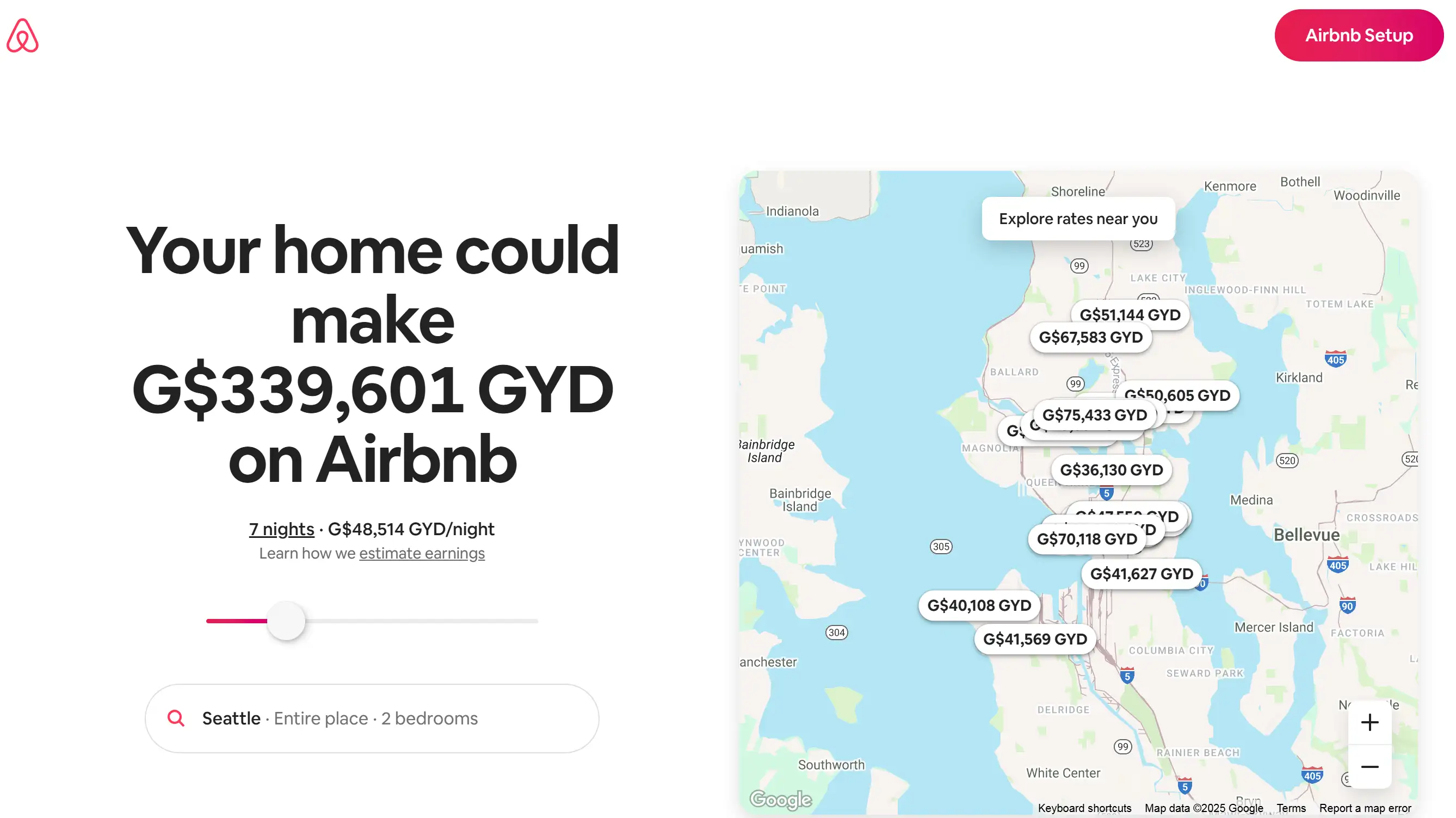
This landing page calculates how much money users can make based on different locations and house types, making their user experience more intimate. It maintains a clean design focused on hosting.
9. GetResponse
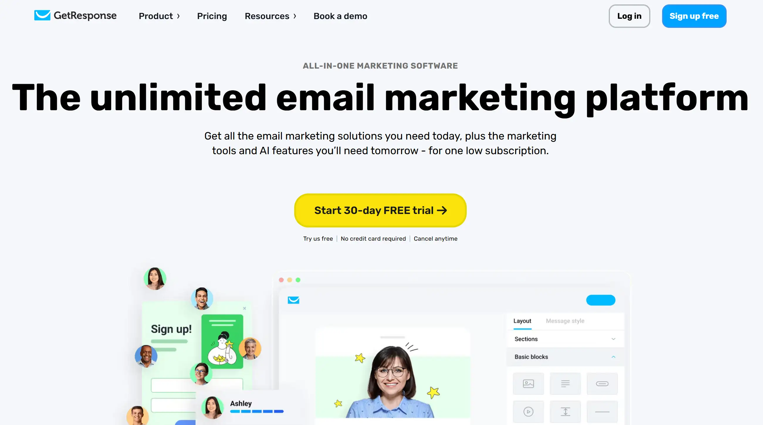
GetResponse’s landing page grabs attention by highlighting several critical words and phrases in the copy. It uses some calls to action throughout the extension page.
10. Monday
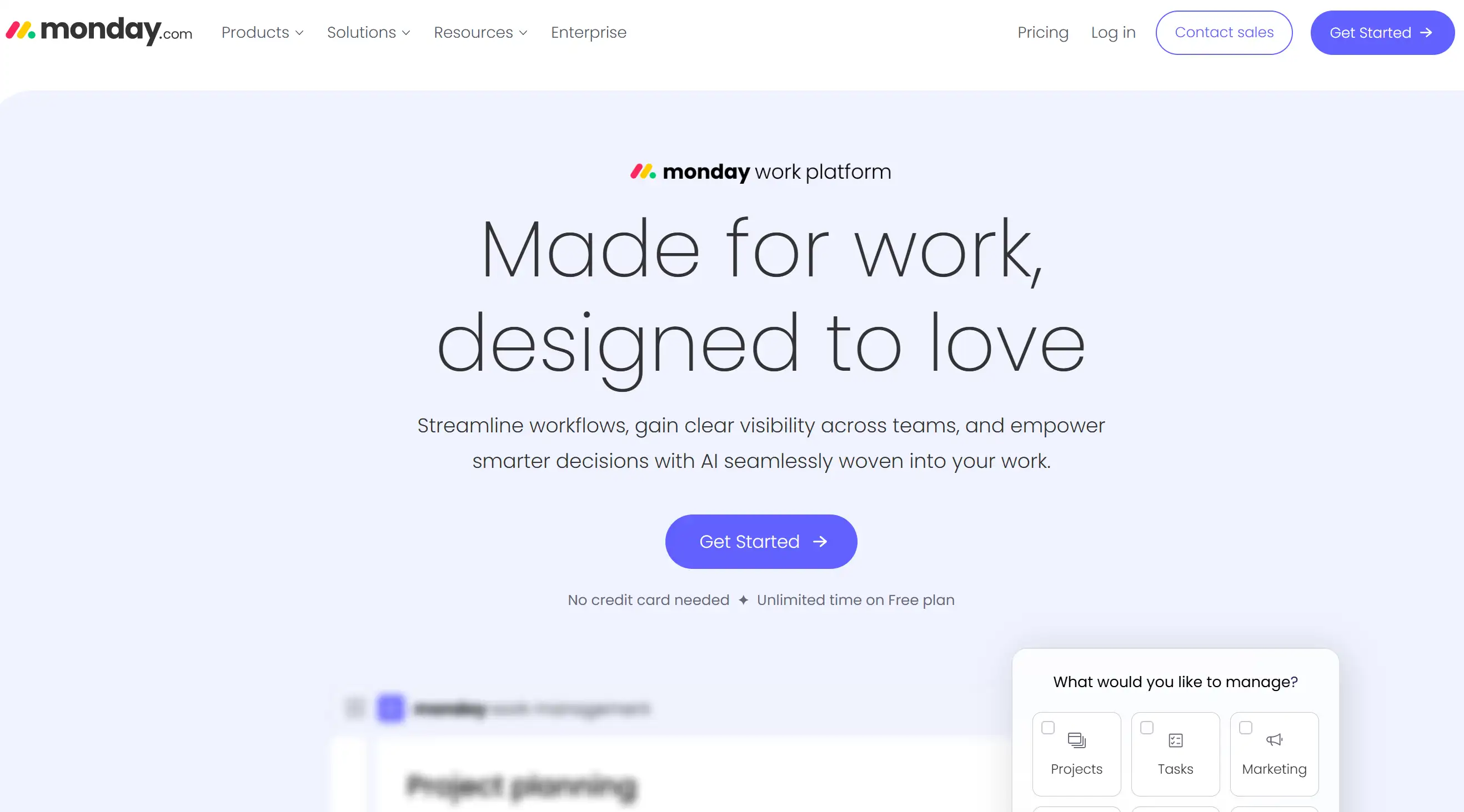
Monday’s landing page cleverly mentioned the ability to integrate with popular B2B services such as Slack, which immediately made it seem more credible. It uses a simple and clear layout to highlight the main features and provides easy-to-use operation steps.
These examples fully illustrate what an effective strategy is, which is to clearly state the value, make the interface simple and easy to use, make the visuals eye-catching and make people want to take action, and cleverly use the "social proof" trick.
Tips for Landing Page Creation
-
Have a Clear and Compelling Headline: The title is the first thing a visitor sees. It has to catch their attention immediately and tell them the most valuable things clearly. The best practice for landing pages is to keep your headline consistent with the promise in your ad or marketing materials.
-
Focus on a Single Conversion Goal: Don’t overwhelm your visitors with too many choices. A well-designed landing page, using landing page best practices for business, will have a primary call to action (CTA).
-
Know Your Audience: The key to making a good landing page is to understand your target audience, what they want, what they fear, and what they are thinking. Adjust your messaging and design style so they can relate to the experience.
-
Craft Persuasive and Benefit-Oriented Copy: Explain how the offer will benefit visitors, rather than simply describing its contents. Highlight the benefits they will receive.
-
Use High-Quality Visuals: Relevant images and videos can significantly enhance your landing page and increase engagement. Ensure they are professional and support your message. To make the landing page look more attractive, stick to the main design approach.
-
Include Social Proof: Using testimonials, reviews, and reassurances such as security badges to make people feel credible will help drive conversions. This is critical for making a great landing page.
-
Keep it Concise and Above the Fold: Make sure critical details such as the title, main benefits, and initial call to action are visible at a glance without having to scroll down to see them. This aligns with landing page best practices for user experience.
-
Optimise for Mobile: A significant portion of web traffic comes from mobile devices. Make sure your landing page is responsive and loads quickly on all devices. This is a basic best practice for landing pages.
-
A/B Test Everything: Always check the various parts of your landing page, like the headline, CTA, and layout. Find out which ones work best for your target audience.
-
Make Your Call to Action Clear and Prominent: The call to action button must be prominent on the page, and the copy must be attractive enough to make people want to click it. The CTA button must be designed clearly to make it both intuitive and attractive to users. This is the key technique in making a landing page.
-
Minimise Distractions: Remove unnecessary navigation bars, links, and clutter that distract visitors from your desired conversion goals. A clean design is a hallmark of landing page design.
-
Ensure Fast Page Load Speed: Slow-loading pages can lead to high bounce rates. Make sure your images and code are optimised so they load quickly. This is the secret to maintaining your users and making your landing page awesome.
-
Track and Analyse Performance: Use analytics tools to monitor your landing page's performance and identify areas for improvement. Using data to make decisions is particularly critical for finding the best landing point and optimising the execution process.
-
Align Your Landing Page with Your Marketing Campaign: The content and design style of landing page best practices for business need to echo the ads or emails that attract traffic. This is a critical landing page best practice to secure trust and clarity.
-
Offer a Clear Value Proposition: Visitors need to understand immediately what they will gain by converting on your landing page. A vigorous value proposition is critical to implementing landing page design tips on a website.
Landing Page Structure to Get High Conversion
-
Strong Headline and Subheadline: As mentioned before, the title needs to be attractive and make people understand what the offer is at a glance. Subtitles can offer readers more background information while highlighting critical selling points. Such a landing page structure also meets the clarity requirements of landing pages.
-
Compelling Visual (Image or Video): A beautiful and precise visual design can immediately show the product features and attract their attention. It is recommended to use visuals on your landing page structure that assist the message and evoke the target emotions.
-
Clear Benefits and Value Proposition: Use bullet points or short paragraphs to clearly state the benefits you provide. The focus should be on what benefits the customers can get. This step is especially key for nailing the persuasion-focused landing page best practices.
-
Social Proof (Testimonials, Logos, Statistics): They make their products seem more convincing and reliable by adding spokespersons, displaying customer testimonials, or putting seals from satisfied customers. This is consistent with the practice of using social proof to achieve the best business landing points.
-
Clear and Prominent Call to Action (CTA): The CTA button needs to look distinctive and use words that inspire action. Place it smartly, preferably in a place that is visible as soon as the page is opened, and then place it again after the critical benefits are clearly stated. A well-optimized CTA can boost conversion rates.
-
Concise Form (if applicable): If you are collecting leads, keep the form simple and only ask for the most critical information. How to minimise the friction of the landing page is one of the best practices.
-
Reinforcement Statement (Optional): Placing a short sentence around the click button (CTA) can reiterate the value of the product or dispel users' doubts. This can further enhance conversion rates, maintaining alignment with the top guidelines for landing pages.
-
Privacy Policy and Terms of Service (Usually in the Footer): These are critical for legal compliance and building trust, and although not directly related to transformation, are indirectly related to the top guidelines for corporate landing pages.
Following the top landing page guidelines and maintaining your landing pages organised can greatly raise your conversion rates and help you achieve your business goals. Remember that continuous testing and optimisation are key to the long-term success of your landing page strategy. Focusing on clarity, user experience, and a compelling call to action ensures they are on the right track.
Beyond Landing Page: Build a Website to Boost Conversion
So there you have it, tips for landing pages and ten landing page best practices that will help you create pages that convert like crazy in 2025. With these landing page tips, mastering the ideal framework isn’t just for design experts anymore. By focusing on clarity, user experience, and a compelling call to action—all essentials in the top guides to business landing pages—it can help you turn those vague numbers into solid, enthusiastic affirmations.
Speaking of making website building less troublesome and as easy as chatting, have you met a good DIY website builder who can help you a lot in website development?
Hi Wegic!

This powerful new tool throws aside the old-fashioned and frustrating way of building a website. Wegic uses its super simple and user-friendly interface so that everyone can easily get started. If you want to create a sophisticated online presence for yourself or a small business, but don’t want to get bogged down in coding or complicated terminology for creating landing page best practices for business, Wegic is your superhero cape. It makes good use of AI, is easy to use, and has a customizable design.
All of these factors make it particularly different. Whether you want to create an eye-catching personal portfolio or a professional corporate website, you can easily create that kind of high-end web page effect with Wegic. Don't bother with complicated applications anymore; Wegic lets you create and manage websites by using simple and natural conversations.
It's time to throw away those complicated technologies and adopt a new era: building your online dream is as easy as chatting with friends!
Written by
Kimmy
Published on
May 19, 2025
Share article
Read more
Our latest blog
Webpages in a minute, powered by Wegic!
With Wegic, transform your needs into stunning, functional websites with advanced AI
Free trial with Wegic, build your site in a click!