Log in
Build Your Site
Contact Page Design: Essential Tips for Non-Designers
Discover essential contact page design tips tailored for non-designers. Learn how to create user-friendly, SEO-optimized contact pages.
You’ve spent hours exploring a website, captivated by its content. You’re ready to reach out—maybe to ask a question, make a purchase, or even collaborate. But then you hit a brick wall—a cluttered, confusing contact page design that leaves you second-guessing whether to bother reaching out at all. Suddenly, that promising connection slips away.
For non-designers, crafting a contact page that’s both functional and inviting can feel like solving a puzzle without the picture. How much information is too much? How do you keep it simple without making it dull? How do you make it visually compelling without overcomplicating the design? Incorporating contact webpage design for portfolio websites can be particularly challenging, as it requires a balance of aesthetics and function to maintain the brand’s visual integrity while ensuring accessibility.
In this article, we’re pulling back the curtain on the contact page design best practices—breaking down what works, what doesn’t, and how to create a seamless user experience that guides visitors from curiosity to connection. Let’s turn that contact page from a missed opportunity into a powerful call to action, especially for those focusing on the contact us page design for portfolio sites that need to make a lasting impression.
Understanding the User's Intent
A contact page is more than just a place to drop your email address—it’s a strategic touchpoint that guides users toward specific actions. It could be someone seeking quick support, inquiring about a product, or leaving feedback, which shapes how they interact with your contact page. Implementing contact page design best practices involves recognizing these varying intentions and structuring the page accordingly.
Identifying Common User Intents: From Inquiries to Feedback
1. General Inquiries
Visitors often reach out with questions about your products, services, or general business information. Create a distinct section labeled “General Inquiries” to streamline these interactions.
2. Support Requests
When users encounter issues, they need a clear and dedicated path to get help. Including a specific “Support” area with FAQs or a direct support form enhances the user experience.
3. Feedback and Testimonials
Encourage users to share their experiences by providing a designated feedback form. This not only gathers valuable insights but also shows that you’re open to listening.
4. Project or Collaboration Requests
For portfolio websites, potential clients or collaborators might be looking to discuss new projects. Incorporating a well-designed “Project Inquiry” section, especially in contact us page design for portfolios, helps you capture leads effectively.

Creating a User-Centric Contact Page Design
Rather than treating your contact page as a static directory, think of it as a personalized interaction point. By implementing user-centric design, you can guide users seamlessly toward the appropriate action.
-
Personalized CTAs: Tailor your calls to action based on the intent, such as “Request a Quote,” “Ask a Question,” or “Get Support Now.”
-
Visual Cues: Use distinct colors, icons, or buttons to differentiate between sections, ensuring users can quickly identify where to go.
-
Structured Layout: Organize content hierarchically, starting with the most common intent (e.g., general inquiries) and working down to less frequent requests (e.g., feedback).
-
Clear, Concise Copy: Speak directly to the user’s needs with straightforward language that aligns with their intent.
Optimizing for Multiple Intents in Contact Page Design
All kinds of users are accommodated by a neatly organized contact page. For instance, on a portfolio website, you could have distinct areas for general comments, press questions, and questions regarding commissioned work. This targeted strategy improves usability and guarantees that every user rapidly locates the information they require.
Applying these contact us page design best practices not only improves user satisfaction but also raises the total performance of your website as a communication tool. Next, we'll look at key components of contact pages that help users navigate through the interaction process.
Essential Elements of an Effective Contact Page
More than simply a form and a phone number, a contact page is a planned area intended to create relationships, develop trust, and turn guests into contacts. Achieving this depends on some particular components. Let's examine the best contact page design practices every non-designer may apply to develop a fascinating, user-friendly contact page.
1. Clear and Concise Headings: Directing Users to the Right Action
Headings play a vital role in guiding visitors toward the intended action as a well-structured contact page uses clear, concise headings to segment different types of inquiries. For instance, a portfolio contact page might include headings like:
-
“Work With Me” for potential project collaborations
-
“Get Support” for troubleshooting and customer service
-
“General Inquiries” for any other questions
Using distinct headings not only organizes the content but also aligns with contact page design best practices by ensuring users immediately know where to direct their message.
2. Simple and Accessible Forms: Reducing Friction in Communication
The heart of any contact page is its form. Keep it simple and easy to navigate, especially for non-designers aiming to implement a contact page design for portfolios. Essential tips for creating an effective form include:
-
Limit Fields: Only ask for essential information like name, email, and message.
-
Dropdown Menus: Use dropdowns to categorize inquiries, streamlining responses.
-
Accessibility Considerations: Ensure that the form is accessible, with clear labels, large clickable areas, and error messages that are easy to understand.
A minimalist approach keeps users engaged and prevents them from feeling overwhelmed, increasing the likelihood of conversion.
3. Multiple Contact Options: Offering Flexible Communication Channels
Not everyone prefers filling out a form, so providing multiple contact methods ensures that users can connect in the way that suits them best. Consider incorporating:
-
Email Address: Clearly display a business email for direct communication.
-
Phone Number: Ideal for urgent inquiries or personal interactions.
-
Social Media Links: Link to platforms where you’re active to maintain continuity in communication.
-
Live Chat or Messenger: If applicable, integrate a chat option to resolve quick questions on the spot.
For portfolio websites, this multi-channel approach can be particularly beneficial, allowing potential clients to choose how they want to discuss potential projects.
4. Location Maps and Business Hours: Building Credibility and Transparency

If your business has a physical location, a map is a must-have element in your contact page design. It provides visual confirmation that your business is legitimate and approachable. Consider:
-
Interactive Maps: Embed a Google Map to show your exact location.
-
Business Hours: Clearly state when you’re available to respond to inquiries.
-
Parking and Access Details: Include additional information that makes visiting your location easier.
Incorporating these features not only aligns with contact us page design best practices but also conveys professionalism and reliability.
5. Call-to-Action Prompts: Encouraging the Next Step
A contact page without a call to action is a missed opportunity. Encourage users to take the next step with actionable prompts like:
-
“Let’s Start a Project” for portfolio sites targeting potential clients.
-
“Request Support” for service-related inquiries.
-
“Ask a Question” for general information requests.
-
“Follow Us” to guide visitors to social media channels for ongoing engagement.
For contact page design for portfolios, these CTAs can be strategically tailored to prompt inquiries about specific projects or services, subtly guiding visitors toward conversion.
Design Principlesfor Non-Designers
Designing a contact page may seem intimidating, but with a few fundamental principles, you can create a polished, user-friendly page without a design background. Whether you’re following contact page design best practices for business sites or creating a contact page design for a portfolio, these guidelines will help you build a page that communicates effectively and looks professional.
1. Utilize White Space Effectively: Let Your Content Breathe

White space is a strategic design element that guides users’ eyes and emphasizes key content. In contact page design best practices, white space is crucial for keeping the layout clean and focused.
-
Keep Forms Uncrowded: Surround form fields with ample space to avoid overwhelming users.
-
Separate Sections Clearly: Use white space to distinguish different contact methods (e.g., email, phone, form).
-
Highlight Key Actions: Leave enough room around CTAs like “Submit” or “Get in Touch” to draw attention and encourage clicks.
For a contact page design for a portfolio, white space can also serve to spotlight creative elements without overwhelming potential clients or collaborators.
2. Stick to a Limited Color Palette: Keep It Cohesive
A harmonious color scheme can elevate the look of your contact page without overcomplicating the design. For non-designers, the trick is to keep it simple—two or three colors max.
-
Primary Color: Use this for headings, buttons, and CTAs.
-
Secondary Color: Apply sparingly for accents or hover states.
-
Background Color: Opt for a neutral, calming shade to prevent visual overload.
Consistency is key. Whether you’re designing a personal portfolio or a business contact page, maintaining a cohesive palette ensures your contact page feels polished and intentional.
3. Choose Readable Fonts and Maintain Consistency: Speak Clearly
Typography can make or break your contact us page design. The goal is to keep text legible and visually appealing without distracting from the message.
-
Choose Sans-Serif Fonts: These fonts (like Arial, Roboto, and Lato) are clean, modern, and easy to read.
-
Limit Font Styles: Stick to one or two fonts to avoid visual chaos.
-
Use Hierarchy: Differentiate headings, body text, and CTAs with size and weight variations.
For contact page design for portfolios, a consistent type hierarchy can also help reinforce a professional and polished look, guiding potential clients through the content effortlessly.
4. Ensure Mobile Responsiveness: Design for All Devices

Over half of all web traffic comes from mobile devices, so ensuring that your contact page is mobile-friendly is crucial. A responsive design adapts seamlessly to various screen sizes, maintaining usability and visual appeal.
-
Use Flexible Grids: Structure your contact page in grids that adjust fluidly based on screen size.
-
Test Form Fields: Ensure that form inputs and buttons remain easily clickable on smaller screens.
-
Optimize Images: Compress images and use SVGs for icons to reduce load time without sacrificing quality.
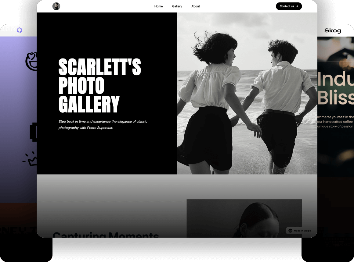
If you’re using a tool like Wegic, the platform’s AI-driven approach can automatically adjust your design for optimal mobile viewing, ensuring that your contact page looks great everywhere.
5. Maintain Visual Hierarchy: Guide the User’s Eye
Visual hierarchy is all about arranging elements in a way that directs users to the most important information first. Think of it as a roadmap that guides visitors from headings to form fields to the “Submit” button.
-
Prioritize Key Actions: Make CTAs stand out with contrasting colors or bold text.
-
Use Size Strategically: Larger fonts and buttons indicate higher importance, while smaller elements recede.
-
Apply Alignment and Spacing: Keep elements aligned to create a clean, organized structure that’s easy to follow.
In contact page design for portfolios, visual hierarchy can also be used to draw attention to specific sections, such as project inquiry forms or collaboration requests.
Use Wegic for a Chat-by-Chat Contact Page Design Experience
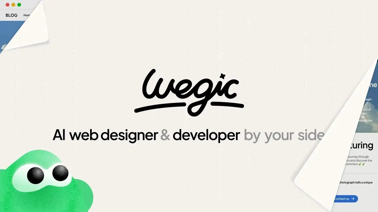
Creating a compelling contact page can be intimidating, especially for those without design experience. That’s where Wegic comes in. Wegic is an AI-powered website builder that turns conversations into fully customized web pages—no coding or design skills required.
Instead of struggling with complicated templates or plugins, you simply chat with Wegic’s AI assistant, Kimmy, to design your contact page step-by-step.
Imagine you’re building a portfolio site and need a sleek, responsive contact page. Here’s how Wegic simplifies the process:
1. Start the Conversation
Open Wegic and type, “I want to create a contact page for my portfolio site.”
2. Receive Real-Time Design Suggestions
Kimmy instantly suggests layouts tailored to your needs—whether it’s a minimalist form, a bold call-to-action, or a visually striking map integration.
3. Customize Contact Forms
Say, “Include a contact form with name, email, and message fields.” Kimmy will generate the form and adjust the layout based on your style preferences.
4. Integrate Maps and Business Hours
Add, “Insert a Google Map showing my office location,” and Kimmy will position it perfectly. You can further request, “Highlight business hours below the form.”
5. Optimize for Mobile
Before publishing, Kimmy ensures the contact page is fully responsive, adjusting text size, button placement, and form structure for seamless mobile access.
6. SEO-Friendly Configuration
Ask, “Make the contact page SEO-friendly,” and Kimmy will implement best practices like alt text for images, optimized headings, and meta descriptions.
Wegic’s chat-driven design process makes contact page design as easy as having a conversation. Whether you’re building a personal portfolio or a business site, Wegic takes your instructions and transforms them into a polished, professional contact page that’s ready to engage visitors and convert leads.
Conclusion
Mastering contact page design best practices doesn’t require advanced design skills. You only need to focus on essential elements like clear headings, accessible forms, multiple contact options, and strategic use of white space. Non-designers can create contact pages that not only look professional but also effectively guide users toward taking action. Whether you’re crafting a business site or a contact page design for a portfolio, implementing these best practices ensures that your page is both visually appealing and highly functional.
To further simplify the process, tools like Wegic make it easy to design customized contact pages through simple chat commands. From real-time design suggestions to mobile responsiveness and SEO-friendly configurations, Wegic transforms your instructions into polished, user-centric contact pages that boost engagement and drive conversions. Ready to turn your contact page into a powerful connection tool? Start with these principles and let Wegic handle the rest.
Written by
Kimmy
Published on
May 13, 2025
Share article
Read more
Our latest blog
Webpages in a minute, powered by Wegic!
With Wegic, transform your needs into stunning, functional websites with advanced AI
Free trial with Wegic, build your site in a click!