Log in
Build Your Site
Master Website Page Layout with 2025’s Top Design Strategies
Design future-proof websites with these top 2025 website page layout strategies. Learn how to boost UX, SEO, and engagement with modern, responsive design techniques.
In the ever-evolving digital landscape, a website serves as the central hub for businesses, creators, and individuals alike. Its effectiveness hinges significantly on one crucial element: website page layout. A well-crafted layout not only enhances the visual appeal but also dictates user experience, engagement, and crucially, its visibility on search engines. As we navigate towards 2025, the principles of effective web design are undergoing a rapid transformation.
This article delves into the importance of mastering webpage layout by exploring the top design strategies poised to dominate in 2025. Understanding and implementing these trends is no longer a luxury but a necessity for creating a website that not only attracts visitors but also converts them and ranks favorably. Join us as we unravel the secrets to designing a future-proof and impactful website layout.
Mobile-First and Truly Responsive Design
The digital realm is increasingly mobile. Statistics consistently show that a significant majority of web traffic originates from smartphones and tablets. Recognizing this fundamental shift, search engines, most notably Google, have adopted a mobile-first indexing approach. This means that the mobile version of your website is the primary version used for indexing and ranking. Therefore, a truly responsive design, built upon a mobile-first design philosophy, is no longer optional but a cornerstone of effective webpage layout in 2025. Mobile-first design entails conceiving and designing the website experience specifically for smaller screens first and then progressively enhancing it for larger displays. This approach ensures that core content and functionality are prioritized for mobile users, who often browse on the go and have limited screen real estate. This contrasts with traditional responsive design, which often adapts a desktop-centric layout for mobile. The SEO benefits of a mobile-first design are manifold. A seamless and fast mobile experience directly contributes to lower bounce rates and increased time on page, crucial user engagement metrics that search engines consider when ranking websites. Furthermore, a well-optimized mobile site tends to load faster, a key factor in Google's PageSpeed Insights and Core Web Vitals assessment. Neglecting mobile-first design in your website page layout strategy for 2025 risks alienating a large segment of your audience and significantly hindering your search engine visibility. Implementing this involves utilizing flexible grids, optimized images (consider next-gen formats like WebP), fluid typography, and touch-friendly navigation. Prioritizing essential content and features for mobile users ensures a streamlined experience that benefits both users and search engine crawlers.
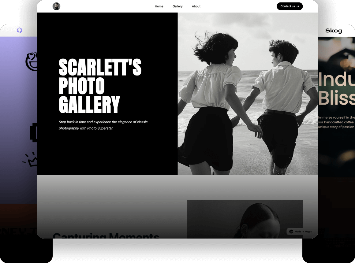
First Impressions Matter: Leveraging Full-Page and Dynamic Headers
In the competitive online arena, capturing a visitor's attention within the first few seconds is paramount. This is where the strategic use of full-page or dynamic headers comes into play as a key element of modern website page layout. These expansive headers, often occupying the entire viewport upon initial load, offer a powerful canvas to convey your brand message and value proposition immediately.
Effective full-page headers typically combine striking visuals – high-quality images or engaging videos – with concise, compelling headline text and clearly defined call-to-action (CTA) buttons. The arrangement often follows intuitive reading patterns, with text positioned on the left and visuals on the right, although variations can be effective depending on the specific content and design goals.
Looking towards 2025, we'll likely see an increase in dynamic headers that incorporate subtle animations, interactive elements, or personalized content based on user behavior or preferences. These dynamic elements can significantly enhance user engagement and create a more immersive initial experience. From an SEO perspective, while the visual elements themselves aren't directly indexed, optimizing the accompanying text with relevant keywords and ensuring fast loading times for these large sections are crucial. Furthermore, a compelling header that encourages users to explore further can lead to lower bounce rates and increased time on site, indirectly boosting your SEO performance. The key is to balance visual impact with clear messaging and optimal performance within your webpage layout.

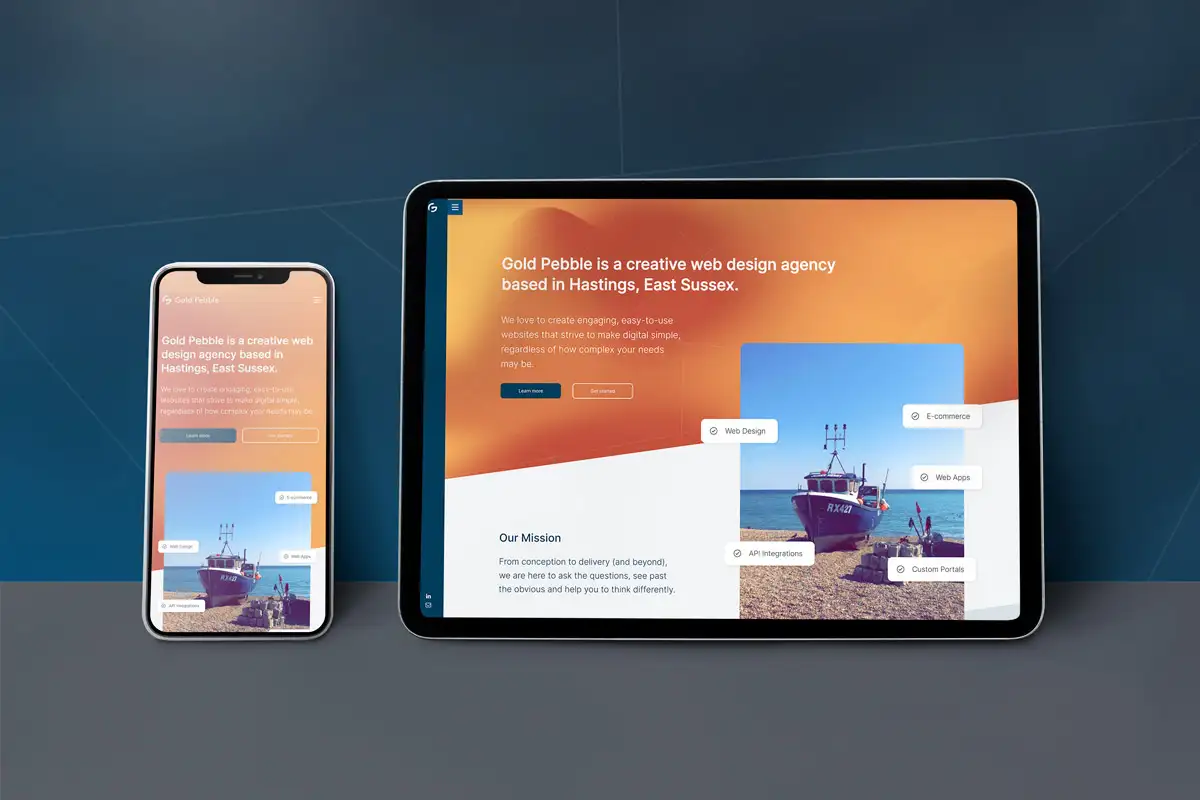
Mastering Grid and Fluid Asymmetric Layouts
A well-structured website page layout is essential for presenting information clearly and guiding users through your content effectively. In 2025, grid-based layouts, particularly those powered by CSS Grid, will continue to be a fundamental tool for achieving this organization and responsiveness. CSS Grid offers unparalleled flexibility in arranging elements in two dimensions, making it ideal for creating complex yet maintainable layouts that adapt seamlessly across various screen sizes.
Alongside the reliability of grid systems, asymmetric layouts are gaining significant traction for their ability to inject visual interest and a sense of modern dynamism into website page layouts. These layouts intentionally deviate from strict symmetry, creating a more unique and memorable browsing experience. However, the effectiveness of asymmetric layouts lies in their careful execution. Maintaining visual balance, establishing a clear visual hierarchy, and ensuring intuitive navigation are crucial to prevent user confusion.
Both grid and asymmetric layouts contribute to SEO by creating a clear content structure that search engine crawlers can easily understand. A well-organized layout improves the flow of information and can enhance internal linking strategies, further boosting SEO. When implementing these layout approaches, consider the user journey and how different content types can be best presented for optimal engagement and understanding. The choice between a structured grid and a more fluid asymmetry should be driven by the website's purpose, brand identity, and the type of content being showcased within the website layout.

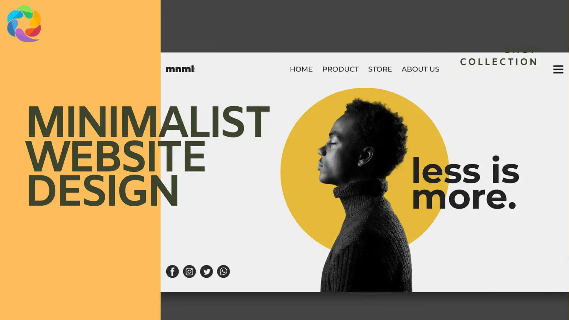
The Strategic Use of Minimalism and Whitespace
In an era of information overload, the principles of minimalism in web design are becoming increasingly vital for creating effective website layouts. Minimalism focuses on stripping away unnecessary elements, leaving only the essential content and functionality. This approach, coupled with the strategic use of negative space, or whitespace, plays a crucial role in enhancing clarity, readability, and user focus.
Whitespace is not simply empty space; it is an active design element that provides visual breathing room, separates content blocks, and guides the user's eye through the page. Generous use of whitespace can significantly improve the legibility of text, highlight important elements, and create a more sophisticated and uncluttered user experience.
The benefits of a minimalist webpage layout extend to SEO as well. Fewer design elements often translate to faster loading times, a significant ranking factor. A clean and focused design can also lead to improved user engagement metrics, as users are not distracted by unnecessary clutter. Embracing minimalism in 2025 means prioritizing clarity, functionality, and performance in your website page layout, ultimately creating a more user-friendly and search engine-friendly website. This involves careful consideration of every element and the deliberate removal of anything that does not serve a clear purpose.
Incorporating Bold Blocks and Strategic Contrast
To capture attention and guide users through key information, the strategic use of bold blocks of color and high visual contrast will continue to be a prominent trend in webpage layout for 2025. These bold elements can be used to highlight calls to action, emphasize important content sections, or visually separate different areas of the page. Vibrant color contrasts can create a strong visual hierarchy, drawing the user's eye to the most critical elements. This technique is particularly effective for brands looking to make a strong visual impact and for SaaS companies highlighting key features or pricing plans. However, it's crucial to ensure that the use of bold colors and high contrast adheres to accessibility guidelines (WCAG) to ensure readability for all users, including those with visual impairments. From an SEO perspective, while color choices don't directly impact rankings, a well-defined visual hierarchy created by bold blocks and contrast can improve user understanding and navigation. This, in turn, can lead to better engagement metrics. The key is to use these elements strategically and purposefully within your website layout to enhance both aesthetics and usability.
Here's guidance on the basics of colors, and you can check out below for more information:
Exploring Anti-Design and Authentic Imperfection
In contrast to the polished perfection often associated with traditional web design, the "anti-design" trend embraces asymmetry, overlapping elements, and intentional imperfections to create a more human and authentic feel in webpage layouts. This approach aims to move away from overly standardized designs towards layouts that feel more unique and relatable. By breaking traditional design rules, websites can create a sense of individuality and memorability. However, it's crucial to strike a balance between embracing imperfection and maintaining usability. The goal is not to create a chaotic or confusing layout, but rather to introduce subtle elements that add character and personality. While not directly influencing SEO algorithms, a unique and engaging website page layout can lead to increased brand recognition and potentially higher user engagement, which can indirectly benefit search performance over time. The key is to ensure that the "imperfections" are intentional and contribute to the overall user experience rather than detracting from it.
The Strategic Integration of Motion and Interaction
Motion design and interactive elements are powerful tools for enhancing user engagement and creating a more dynamic browsing experience within a website layout. Subtle animations, such as parallax scrolling effects, hover animations, and scroll-triggered interactions, can add visual interest and guide users through the content in an engaging way. Background videos, when used judiciously and optimized for performance, can also contribute to a more immersive experience. Looking towards 2025, we can expect to see even more sophisticated and context-aware interactive elements integrated into webpage layouts. These elements can range from micro-interactions that provide feedback on user actions to more complex interactive storytelling experiences. From an SEO perspective, it's crucial to ensure that motion and interactive elements are implemented in a way that doesn't negatively impact page loading speed or core web vitals, particularly Cumulative Layout Shift (CLS). Overly complex or poorly optimized animations can be detrimental. However, when implemented effectively, these elements can significantly increase time on page and reduce bounce rates, sending positive signals to search engines. The key is to prioritize performance and user experience when incorporating motion and interaction into your website layout. Typography plays a crucial role in both the visual aesthetics and the readability of a website's page layout. In 2025, we'll likely see a continued emphasis on expressive and bold fonts, including the resurgence of serif fonts for a touch of classic elegance and the increasing adoption of variable fonts for their performance benefits and design flexibility. Maximalist typography, featuring oversized or layered text, can be used strategically to create strong visual statements and enhance brand identity in key areas of the website page layout, such as headlines and hero sections. However, it's essential to balance these bold choices with considerations for readability and accessibility in body text. From an SEO standpoint, clear and readable typography contributes to a better user experience, leading to longer engagement. Furthermore, using semantic HTML tags for headings and text allows search engines to understand the structure and importance of your content. Choosing web-safe fonts or efficiently loading custom fonts is also important for page speed optimization.
Embracing Sustainable and Accessible Web Layouts
As environmental consciousness grows, sustainable web design practices are gaining importance. This includes creating efficient and lightweight webpage layouts that minimize resource consumption. Techniques such as optimizing images (using formats like WebP and responsive images), writing clean and efficient code, and leveraging browser caching can contribute to a more sustainable website.
Accessibility is another critical aspect of responsible website layout. Designing layouts that are inclusive and meet WCAG (Web Content Accessibility Guidelines) ensures that your website is usable by people with disabilities. This includes providing proper alt text for images, ensuring sufficient color contrast, using semantic HTML, and making your website navigable via keyboard.
Both sustainability and accessibility can indirectly benefit SEO. Faster loading times, a key aspect of sustainable design, are a direct ranking factor. Accessible websites tend to have better user engagement and a wider reach, both of which can positively influence search performance. Prioritizing these aspects in your website layout for 2025 is not only ethical but also strategically sound.
Core Web Vitals and Layout Optimization
Google's Core Web Vitals – Largest Contentful Paint (LCP), First Input Delay (FID), and Cumulative Layout Shift (CLS) – are crucial(1) metrics for assessing the user experience of your webpage layout and significantly impact your SEO rankings. Optimizing your layout to improve these vitals is essential in 2025.
-
Largest Contentful Paint (LCP): This measures the time it takes for the largest content element on the page to become visible. An efficient webpage layout ensures that critical content is prioritized and loads quickly. Optimize image sizes, leverage browser caching, and minimize render-blocking resources to improve LCP.
-
First Input Delay (FID): This measures the time it takes for the browser to respond to the first user interaction. A well-structured layout avoids excessive JavaScript execution that can delay interactivity. Optimize your code and defer non-critical JavaScript to enhance FID.
-
Cumulative Layout Shift (CLS): This measures the amount of unexpected layout shifts that occur during the loading process. A stable and predictable website layout avoids elements jumping around, providing a smoother user experience. Ensure that images and ads have defined dimensions and avoid injecting content above existing content without user interaction.
By consciously designing your webpage layout with Core Web Vitals in mind, you not only improve user experience but also directly enhance your website's SEO performance.
Analyzing Effective Website Page Layouts for 2025
To illustrate the practical application of these trends, let's analyze a few hypothetical examples of websites that effectively leverage modern webpage layout strategies for 2025:
-
E-commerce Store: Features a mobile-first design with a prominent full-page header showcasing a hero product and a clear call to action. Product listings utilize a clean grid layout with ample whitespace and high-quality product images. Interactive elements, such as quick view options and animated add-to-cart buttons, enhance engagement. The layout prioritizes fast loading times and clear navigation for a seamless shopping experience on all devices.
-
Portfolio Website: Employs an asymmetric layout to showcase projects in a visually dynamic way. Bold typography highlights project titles, and subtle motion design adds a touch of sophistication. The mobile experience is carefully crafted to present the portfolio in a clear and easily navigable manner. Minimalism and ample whitespace ensure that the focus remains on creative work.
-
SaaS Platform: Utilizes bold blocks of color to differentiate key features and pricing plans. A sticky navigation ensures easy access to important sections. The layout incorporates a clear visual hierarchy and concise text to communicate value propositions effectively. Interactive demos and explainer videos are seamlessly integrated to enhance user understanding. The design prioritizes fast loading times and a responsive layout for a smooth user experience across devices.
-
Blog: Features a clean and readable layout with generous whitespace. Bold typography is used for headings and subheadings to improve scannability. Mobile-first design ensures that content is easily digestible on smaller screens. Subtle motion design, such as smooth scrolling and hover effects, enhances engagement without being distracting. Related articles are strategically placed to encourage further exploration.
Final: Designing for Success in 2025
Mastering website page layout is an ongoing process that requires staying abreast of the latest design trends and technological advancements. As we move towards 2025, the strategies discussed – from prioritizing mobile-first design and leveraging dynamic headers to embracing minimalism and optimizing for core web vitals – will be crucial for creating websites that not only look visually appealing but also provide exceptional user experiences and achieve strong search engine visibility. By understanding and implementing these principles, you can position your website for success in the evolving digital landscape. Remember that the ultimate goal is to create a webpage layout that effectively communicates your message, engages your audience, and drives your desired outcomes.
Ready to Build a Website That’s Future-Proof by Design?
Don’t just follow the trends—implement them. Use Wegic’s intuitive design tools to bring these 2025 website layout strategies to life with speed, flexibility, and SEO confidence. Start creating with Wegic and elevate your layout today.
Written by
Kimmy
Published on
Jun 26, 2025
Share article
Read more
Our latest blog
Webpages in a minute, powered by Wegic!
With Wegic, transform your needs into stunning, functional websites with advanced AI
Free trial with Wegic, build your site in a click!