Log in
Build Your Site
10 Blog Footer Examples: Engage Readers with These Creative Footers
Are you trying to find or create some footers for your blog? Using creative footers can help you to engage with readers! Let's check out some examples together!
When designing a website, we often focus on the layout of the homepage, navigation clarity, and visual appeal, but we often overlook an important component hidden at the bottom of the page—the footer. Its location seems destined to be ignored, but in fact, the role of the footer is far more than we think. That is why research into footer examples is important. The footer is more than just the "end" of the website. It is an important area that can carry key information, enhance the user experience, and enhance the credibility of the brand.
Whether it helps users quickly locate the links they need, provides contact information, or strengthens the SEO structure, a good footer can add points to value to the website. Research by Nielsen Norman Group shows that although users only spend 4% of their attention in the footer on average, it shows that visitors will actively look for valuable information in this section. Users are arriving at the footer more frequently than before.
This means that ignoring the footer is a key opportunity to connect with users and guide conversions. This article will take you deep into 10 creative footer design examples. These website footer examples will show how to make the footer not only beautiful but also practical. Design highlights truly transform it into a powerful tool to attract readers and promote engagement. If you're planning to design or optimize your website footer, take a look at these successful examples forinspiration.
What is a website footer?
The website footer is an area at the bottom of each page of the website. Although it is located at the back, it plays a vital role. It usually contains copyright notices, privacy policies, site maps, contact information, social media icons, brand logos, and even email subscription forms.
In the web page structure, the design of the footer is usually consistent throughout the site to ensure that users can easily find key links and information on any page. It is not only the end of the content but also a summary and extension of the information. Many people mistakenly believe that with the top navigation bar, they no longer need to pay attention to the design of the footer. But the fact is just the opposite. When users cannot find the information they need in the navigation bar, they often subconsciously scroll to the bottom of the page to find the answer.
Research by Nielsen Norman Group shows that users only spend 57% of their page browsing time on the first screen. The study found that as the screen size increases, the time users spend browsing pages above the first screen decreases. Especially today, when "scrolling" has become the norm, users are more inclined to slide down the page to find content, which also makes the importance of the footer rise. A creative footer design can not only improve the usability of the website but also enhance the professional image and credibility of the brand.
4 reasons why creative footer design is important
When designing a website, the footer is often overlooked. Hiding at the bottom of the page may seem unimportant. However, in fact, a well-designed footer can not only improve the user experience but also increase conversion rates, optimize SEO, and help you convey key information.
Improve navigation efficiency
When users browse to the bottom of the page, they may still want to learn more or continue to explore other parts of the website. At this time, a clearly structured and information-focused footer is like a second navigation bar on the website: it can quickly link to important pages and make up for the content not covered by the top navigation. Therefore, a good footer can retain potential customers who have already slid to the bottom of the page.
Convey key information and brand impressions
The footer is the last stop for the website to convey information. Although it occupies a small space, it can affect the user's overall perception of the brand. A concise and powerful slogan; a general description of the brand and services; key information such as customer service, business hours, and contact information; legal notices, copyright information, and other compliance requirements. This information will help you convey key information and brand impression. When other design modules cannot place this information, the footer becomes the ideal place for it.
Convert users
Don't underestimate the role of footers in the conversion path. For users who have already carefully browsed the content, the footer can provide a subscription form to collect user email addresses, display limited-time offers or discount information, placeCTA buttons such as "Contact Us" and "Start Trial," and link to social media to guide users to pay more attention to the brand. As long as the design is reasonable and the content is relevant, the footer can be a powerful tool for you to obtain leads and increase conversions.
Improve SEO rankings
As part of the overall page structure, the footer can also be of great benefit to SEO if it is laid out properly. If you add a sitemap or page links, it can help crawlers understand the website hierarchy. In addition, internal links help pass page authority. In addition, a short description with keywords helps search engines understand the theme of the website. Adding legal, address, and contact information can enhance search engines' judgment of the credibility of the website. In general, a footer with relevant links and a clear structure can help the website be better included and ranked.
10 blog footer examples you should know
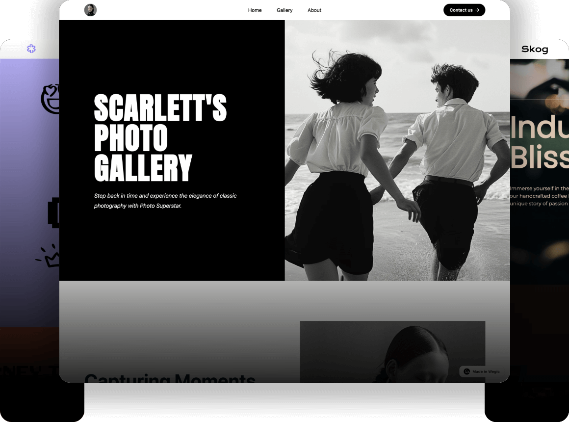
1. Wegic
Wegic's website footer clearly lists all the information users need. For example, product, company, and resources. Above the website footer, the logos of Wegic's three AI assistants are highlighted. On the far left, Wegic's brand logo is listed separately. At the bottom, Wegic's social media icons are also listed, and users can click to jump to Wegic's social media webpage.
Want to build a well-designed footer for your website? Try Wegic! You can create creative footer designs through Wegic's AI assistant. Tell Wegic's AI assistant your ideas and create your own creative footer design!
Click the picture here to find out Wegic's best practices! ⬇️

2. Clade Design
When it comes to a footer example, Clade is a must-see. Clade Design's homepage is a creative and eye-catching design with contrasting shapes, eye-catching micro-interactions, and delightful use of color. The recurring wavy background is a clever design element in the overall layout. A blue wave appears at the top of the page, and each content block has a different background color, creating a layered visual rhythm. At the bottom of the page, we see a similar blue wave again, forming a natural ending to the entire page and making people intuitively feel that they have reached the end of the page.
This footer design is simple and effective: it contains only a few links, a "Contact Us" call to action button on the left side of the page, and a block of social media icons on the right. It is highly consistent with the style of the entire site, with a clear layout and direct information communication, and is a model of excellent web design.
3. Think32
Think32 is an Australian dental practice marketing agency, and its website design accurately conveys its brand positioning. The overall modern and simple style of the page, supplemented by carefully selected dental-related images, shows the professionalism and aesthetics pursued by high-performing agencies.
Particularly worth mentioning is the footer design: thecall to action is centered and highlighted, and there is a light pink subscription button next to the email contact form, which naturally guides the user's attention to the form. At the same time, we also really like the line of text in the blank area on the left, "Thoughtful marketing for growing dental practices." This not only summarizes Think32's service concept but also further highlights its industry focus and professional attitude.
4. Loungefly
Loungefly's website footer is one of the most creative footer examples. It is concise, clear, and highly usable. Although it contains a wealth of practical links, the overall layout still maintains a good sense of hierarchy and avoids the problem of information overload. It is worth mentioning that Loungefly cleverly places the brand logo in a striking position, effectively strengthening the brand recognition and making users still impressed by the brand at the end of browsing. It also includes links to the brand's social media and social media icons, allowing users to easily connect to the brand's social media pages.
5. Lola Pate
Lola Pate's minimalist website is aesthetically pleasing in every pixel. The soft colors and serif fonts make it seem like you're transported to a retro beachfront shop. The footer design continues this style with simple yet complete elements. It includes an email sign-up form, a beautiful but unclickable "Join Us" call to action button, an image with a link to a special offer, a "Learn More" button, social media links, copyright information, and a double-column site navigation. Although there aren't too many fancy designs, the entire footer is clearly laid out, complete, and very approachable. It is a simple but beautiful footer example.
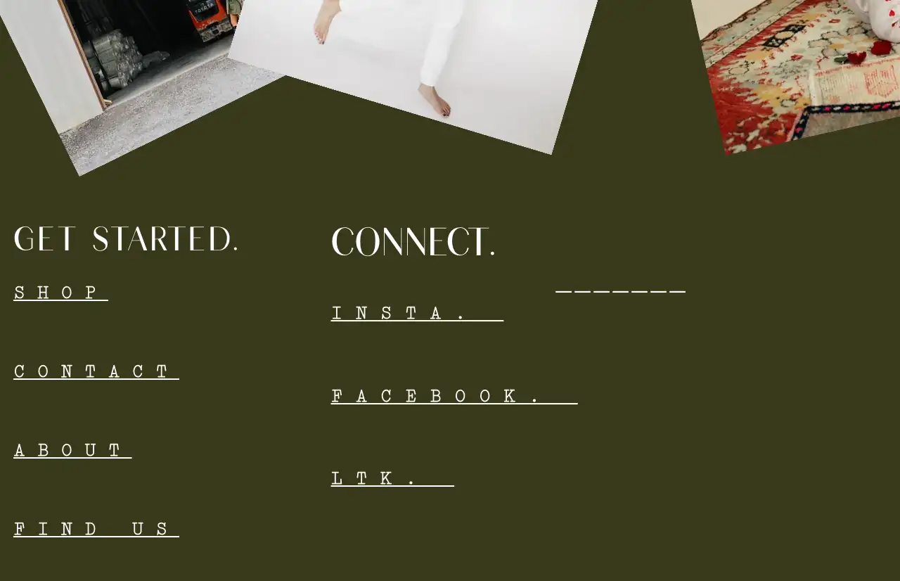
Image by Lola Pate
6. Target
The footer of Target's website contains useful links that users expect, like the company logo, legal notices, and social network sites. It is well-organized and content-rich. It is fascinating to note how strategically Target positions icons next to the links, which not only contributes to the visual experience but also helps in brand recognition. All this attention to detail not only makes it easy to navigate but also contributes to visual appeal, which makes it one of the best website footer examples ever.
7. Oreo
Oreo's website uses the same classical blue and white colors in its footer as well and cleverly incorporates the Oreo pattern and brand logo to perfectly represent the brand image. Not only is the footer visually integrated, but it also includes useful features like email subscription and social media links to facilitate the discovery and interaction of users with the brand. The footer is useful and stunning and is one excellent instance of a creative brand-based footer design.
8. Manoverboard
Another interesting web design is this one, which uses the combination of various visual effects along with the simplicity of the plain ivory background and the lack of serifed fonts to create a clean and fresh ambiance. The footer, too, reflects this same style with clear structure and usability. Some contact information, social media links, and subscription forms to the newsletter are aligned above the footer, which are readable enough to provide information and keep users connected. The core content of the footer is reserved for necessary content such as copyright statements, privacy statements, and accessibility to meet users' rights requirements.
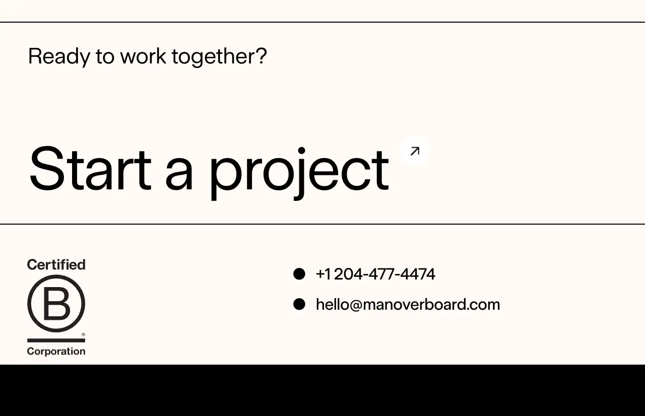
Image by Manoverboard
9. Drunk Elephant
Drunk Elephant is a high-end, biocompatible skincare brand, and its footer fully reflects the professionalism and individuality of the brand. The footer contains all the necessary content users require. Clearly categorized product menu, comprehensive brand introduction, legal details, as well as social media handles, are provided, making it easy for users to search for what they are looking for in a matter of moments and enhancing user experience. In addition to readability and simplicity of the design as a whole, the footer of Drunk Elephant also makes clever use of the brand's bold, sunny design elements, making the entire footer not only functional but also beautiful and recognizable. Not only does it contribute to the brand's appearance, but it also gives users an idea about the energy and unique beauty of the brand.
10. Spline Group
The Spline Group's footer design perfectly reflects its inherent business philosophy of embracing simplicity and concise communication. The clean visual appearance from the white background and black text gives the site a professional appearance. The company address, along with the links to Instagram, LinkedIn, and career recruitment, are well presented in the footer,so users are able to observe company dynamics and recruitment information at a glance. The highly actionable "Let's talk" footer text opens the email window the very moment one clicks on it, greatly facilitating the user contact experience. Far beyond simply cleverly incorporating the company's sense of purpose and brand imagery, this design visually isolates the CTAas something desirable to get the users to actually do it.

Image by Spline Group
Conclusion
As these website footer examples have demonstrated, a blog footer is not the end of the page, at least, not yet! It's a tactical space where you can drive your readers, establish trust, and create a lasting impression. The challenge is to ensure your footer aligns with your brand tone and your readers' requirements. A footer can be just what keeps readers interested, and returning in greater numbers.
Written by
Kimmy
Published on
Jun 16, 2025
Share article
Read more
Our latest blog
Webpages in a minute, powered by Wegic!
With Wegic, transform your needs into stunning, functional websites with advanced AI
Free trial with Wegic, build your site in a click!