Log in
Build Your Site
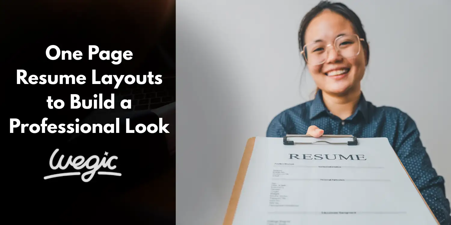
One Page Resume Layouts to Build a Professional Look
Design a compelling one-page resume that grabs recruiter's attention in seconds. Learn layouts, design principles, and tools to build your best resume in 2025.
In today's fast-paced job market, your resume is often the first, and sometimes only, chance you get to make a strong impression. With recruiters sifting through hundreds, sometimes thousands, of applications, brevity, clarity, and visual appeal are paramount. This is where the strategic advantage of a one-page resume comes into play, particularly in the competitive landscape of 2025. A well-executed professional resume design isn't just about looking good; it's about communicating your value proposition quickly and effectively.
A one-page resume is exactly what it sounds like – a distillation of your professional history, skills, and achievements onto a single sheet. It forces you to be selective, focusing only on the most relevant and impactful information. Why is this so important now? Employers and hiring managers are drowning in applications. They need to quickly assess if a candidate is a potential fit before investing more time. A concise, well-structured one-page document respects their time and demonstrates your ability to prioritize and communicate clearly.
Beyond just saving space, a focused one-page resume layout enhances readability and ensures that the most critical information isn't buried on a second or third page that might never be seen. Whether you're applying for roles in technology, creative fields, finance, healthcare, or virtually any other sector, the principles of a strong one-page presentation hold true. It's about creating a powerful, scannable snapshot that highlights your strengths and encourages the recruiter to learn more. Mastering the art of a one-page resume is a crucial step in building a polished, professional resume layout that stands out in today's digital-first recruitment environment.
Why Choose a One-Page Resume in 2025?
The modern job search landscape is drastically different from even a decade ago. The sheer volume of applications for popular roles, combined with evolving recruiter habits and technology, makes the case for a one-page resume stronger than ever in 2025. Why is this format becoming the best resume format for many?
Firstly, let's talk about attention spans. Studies and eye-tracking research consistently show that recruiters spend mere seconds initially scanning a resume to decide if it warrants further review. This rapid evaluation means your most compelling qualifications need to be immediately visible. A multi-page document forces the reader to turn pages, which introduces friction and delays the process. A single page ensures everything they need for that initial assessment is right there.
Secondly, mobile recruitment is on the rise. More and more candidates apply for jobs using their smartphones, and consequently, recruiters often review applications on mobile devices or tablets. Scrolling through multiple pages on a small screen is cumbersome and frustrating. A well-designed one-page resume, especially one saved as a PDF, is significantly easier to navigate and digest on a mobile device, ensuring your application is viewed favorably regardless of the screen size.
Furthermore, the first impression is crucial. A clean, organized, and concise one-page resume immediately signals professionalism and attention to detail. It suggests that you are capable of synthesizing information and presenting it clearly, valuable skills in any role. A cluttered, multi-page document, in contrast, can appear disorganized or indicate a lack of focus.
Crucially, the rise of Applicant Tracking Systems (ATS) also impacts formatting. While ATS can read multi-page documents, ensuring critical keywords and information are on the first page can sometimes be beneficial, especially with older or less sophisticated systems. An ATS-friendly single-page format, when properly constructed with standard headings and minimal complex formatting, makes it easier for these systems to parse your data correctly and ensure your application doesn't get overlooked before it even reaches a human. The need for a modern, concise resume format that is both human-readable and machine-readable is paramount, and the one-page structure often achieves this balance effectively. It’s not just about fitting everything on one page; it’s about intelligent design for modern recruitment realities.
Top One-Page Resume Layouts Explained
Choosing the right professional resume design is a critical step in creating a compelling one-page document. There isn't a single "best" layout; the ideal choice depends heavily on your career stage, industry, and personal brand. Let's explore some of the most effective one-page resume layouts and understand who they suit best.

1. Classic Chronological Layout
This is perhaps the most traditional and widely recognized resume format. The classic chronological layout organizes your work experience in reverse chronological order, starting with your most recent job and working backward.
Structure Breakdown:
-
Header: Your contact information (Name, Phone, Email, LinkedIn URL).
-
Summary/Objective: A brief (3-4 lines) statement summarizing your key qualifications or career goals.
-
Work History: The core section, listing employers, locations, job titles, and employment dates. Under each role, use bullet points to detail your responsibilities and, crucially, your achievements with quantified results.
-
Education: List degrees, institutions, graduation dates, and relevant honors or coursework.
-
Skills: A section listing your key competencies, often divided into technical skills (hard skills) and soft skills.
Who it’s Best For:
This layout is ideal for professionals with a stable career progression within a single industry. It clearly demonstrates growth, tenure, and a consistent work history. It's particularly effective for roles where experience and a steady career path are highly valued. This includes sectors like business, law, finance, healthcare, and established corporate environments.
Pros:
-
Highly familiar and easy for recruiters and ATS to understand.
-
Highlights career progression and stability.
-
Focuses on work experience, which is often the most important factor.
Cons:
-
Can expose gaps in employment history.
-
Less effective for career changers or those with non-linear paths.
-
Might not highlight transferable skills as effectively as other formats.
2. Functional (Skills-Based) Layout
The functional layout shifts the focus away from chronological work history and towards your skills and abilities. It groups your experience by skill sets rather than employers.
Structure Breakdown:
-
Header: Contact Information.
-
Summary/Objective: A statement often highlighting key skills or career focus.
-
Skills/Areas of Expertise: This is the prominent section. It lists 3-5 key skill categories (e.g., "Project Management," "Software Development," "Marketing Communications"). Under each category, use bullet points to describe specific achievements and responsibilities that demonstrate proficiency in that skill, often without explicitly mentioning the employer.
-
Accomplishments (Optional but Recommended): A section detailing significant achievements.
-
Minimal Work History: A brief listing of employers, job titles, and dates, often without detailed bullet points.
-
Education: Standard education listing.
Who it’s Best For:
This layout is excellent for individuals with non-traditional career paths, freelancers, recent graduates with limited work experience but strong project work or internships, or those looking to make a significant career change. It allows you to showcase transferable skills and relevant abilities regardless of where or when they were acquired.
Pros:
-
Effectively highlights skills and abilities, even with employment gaps.
-
Good for career changers or those with diverse experience.
-
Can de-emphasize a lack of direct, linear work history.
Cons:
-
Less familiar to recruiters and ATS, potentially cause confusion.
-
Can raise red flags for employers who prefer to see chronological progression.
-
Might require significant effort to ensure ATS compatibility.
3. Hybrid (Combination) Layout
The hybrid layout, known as one of the best one-page resume layouts, combines the best aspects of the chronological and functional formats. It leads with a strong skills summary but also includes a detailed chronological work history.
Structure Breakdown:
-
Header: Contact Information.
-
Summary/Profile: A comprehensive section that often blends a career overview with a highlight of key skills and accomplishments.
-
Skills Section: A dedicated area listing specific hard and soft skills, sometimes categorized.
-
Work History: A chronological listing of employers, job titles, dates, and detailed bullet points describing responsibilities and achievements for each role.
-
Education: Standard education listing.
Who it’s Best For:
This is a versatile layout suitable for many professionals, especially those with diverse skill sets and a solid work history. It's excellent for showcasing both what you can do (skills) and where you've done it (experience). It works well for mid-level professionals, individuals in rapidly evolving fields, or those transitioning within the same broad industry. It provides a great balance, making it a strong contender for a modern, professional resume design.
Pros:
-
Highlights both key skills and relevant work experience.
-
Provides context for your skills by showing where you applied them.
-
More flexible than purely chronological or functional formats.
Cons:
-
Can be challenging to fit onto a single page if you have extensive experience.
-
Requires careful organization to avoid clutter.
-
Might require more effort to tailor for specific applications.
4. Modern Minimalist Layout
The modern minimalist layout prioritizes clean lines, ample whitespace, and simple, elegant typography. It's about presenting information clearly and aesthetically pleasing, often using subtle visual cues like skill icons or progress bars (used sparingly and carefully for ATS compatibility).
Structure Breakdown:
-
Header: Clean, prominent name and contact information.
-
Summary/Profile: Concise and impactful, often using a different font weight or style.
-
Experience/Work History: Often presented with minimal clutter, sometimes using a timeline visual element (again, with caution for ATS). Bullet points are typically concise and action-oriented.
-
Skills: Can use simple icons, bars, or a clear list.
-
Education: Presented clearly.
-
Optional Sections: Portfolio links, personal website.
Who it’s Best For:
This layout is popular in creative industries (design, marketing, media), technology, and startup environments where innovation and aesthetic appeal are valued. It's for candidates who want their resume to reflect a modern, clean, and professional brand. It demonstrates an understanding of design principles and attention to detail. This is a prime example of a minimalist resume design.
Pros:
-
Visually appealing and easy to read.
-
Projects a modern and professional image.
-
Ample whitespace reduces clutter and highlights key information.
Cons:
-
Can be less familiar to traditional recruiters.
-
Heavy reliance on visuals can hurt ATS compatibility if not done correctly.
-
Requires strong design sensibility to execute effectively.
5. Infographic Resume Layout
The infographic resume uses visual elements like charts, graphs, timelines, and icons to represent information graphically. It's essentially a visual narrative of your career.
Structure Breakdown:
-
Header: Often integrated into the visual design.
-
Visual Summary: Key statistics or highlights presented with icons or charts (e.g., "Years of Experience," "Projects Completed").
-
Skills: Represented using bars, graphs, or icons.
-
Experience Timeline: A visual representation of your work history.
-
Education: Can be included with a visual element.
-
Portfolio/Website Integration: Often includes prominent links or QR codes.
Who it’s Best For:
This layout is best suited for professions where visual communication is paramount, such as graphic designers, web designers, marketers, illustrators, and other creative roles. It demonstrates your design skills and ability to present complex information in an engaging, visual format.
Pros:
-
Highly engaging and memorable.
-
Effectively showcases creativity and design skills.
-
Can stand out in a pile of traditional resumes.
Cons:
-
Significantly higher risk of poor ATS compatibility; often requires a separate text-based resume version for online applications.
-
Not suitable for traditional or conservative industries.
-
Can become cluttered easily if not designed carefully.
-
Requires significant design skill or specialized tools to create.
Choosing the right layout is foundational to building a compelling one-page resume. Consider your career path, the industry you're targeting, and your personal brand to select the format that best showcases your unique value. Remember, the goal is to make it as easy as possible for the hiring manager to see why you are the ideal candidate.
Tailored Layouts for Different Industries
The effectiveness of a one-page resume layout is significantly enhanced when it's tailored to the specific norms and expectations of the industry you're targeting. While general best practices apply, certain layouts naturally resonate better with recruiters in different fields. Here's a look at recommended layouts by industry and why they work, helping you refine your resume template guide based on your target roles.
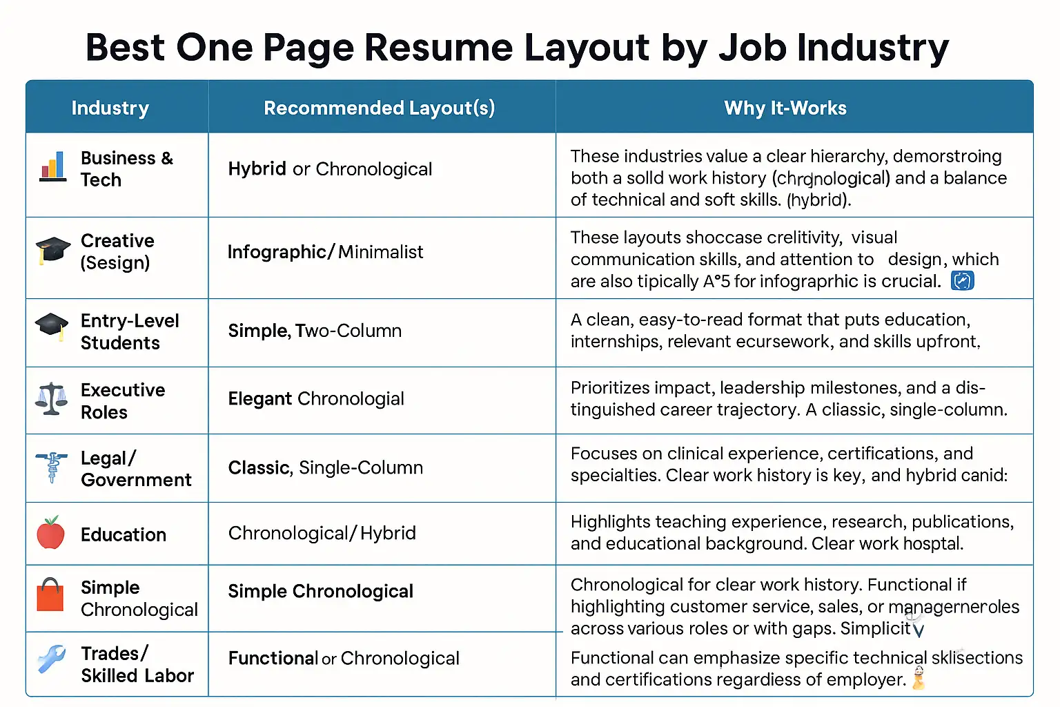
Using secondary keywords like resume templates, layout for business, creative resume design, best resume format for students, ATS-friendly resume, and industry-specific terms within these descriptions helps reinforce the relevance for targeted searches. For instance, when discussing the Creative industry, integrating terms like "showcasing design skills," "visual portfolios," and creative resume design directly addresses the needs of job seekers in that field. Similarly, entry-level resume layout, emphasizing education, projects, and internships, aligns with what recruiters look for in less-experienced candidates.
Understanding these industry nuances allows you to move beyond a generic resume and craft a tailored one-page document that speaks directly to the hiring managers in your target sector. It shows you've done your homework and understand the specific qualifications and presentation styles valued in that field.
Want to download a free template to see how these layouts look in practice? Exploring different templates can help you visualize the structure best suited for your industry and experience.
Best Practices for One-Page Resume Design
Beyond choosing the right layout, implementing strong design principles is essential to making your one-page resume layout effective and professional. Good design isn't just about aesthetics; it's about clarity, readability, and ensuring your message is easily absorbed.
Here are the key best practices for optimizing your one-page resume design:
-
Strategic Use of White Space and Alignment: Don't feel the need to cram every corner of the page. Ample white space (margins, space between sections, and lines) gives the reader's eye room to breathe and makes the document feel less overwhelming. Consistent alignment – left, right, or centered – creates a clean, organized look. Poor alignment looks sloppy and unprofessional.
-
Font Selection Matters: Choose professional, easy-to-read fonts. Sans-serif fonts (like Arial, Calibri, Helvetica, Lato, or Open Sans) are generally preferred for digital readability. Stick to one or at most two font families throughout the document for consistency. Use variations in size and weight (bold, italics) strategically for headings and emphasis, but avoid excessive use. A standard font size for the main body text is typically 10-12 points.
-
Resume Length-Concise but Complete: The goal is one page, but don't sacrifice crucial information just to fit. Prioritize relevance. If an experience or skill doesn't directly support your target role, leave it out. Be ruthless in editing. Every word counts on a single page. Ensure that while concise, your resume still tells a complete story of your relevant qualifications.
-
Powerful Bullet Points: Action Verbs + Quantified Results: This is where you showcase your impact. Start each bullet point with a strong action verb (e.g., "Managed," "Developed," "Implemented," "Achieved"). Wherever possible, quantify your achievements with numbers, percentages, or data (e.g., "Increased sales by 15%," "Reduced project completion time by 10 days," "Managed a team of 5"). Quantifiable results provide concrete evidence of your value and make your accomplishments more impactful.
-
Keywords from Job Descriptions: Tailor your resume for each application by incorporating keywords from the job description. Applicant Tracking Systems (ATS) scan for these specific terms. Read the job posting carefully and integrate relevant skills, qualifications, and responsibilities into your resume naturally. This is a crucial step for creating an ATS-friendly resume.
-
Standard Headings for ATS: Use standard, easily recognizable headings for your sections (e.g., "Work Experience," "Education," "Skills"). Avoid overly creative or unusual headings that an ATS might not recognize.
-
Avoid Heavy Visuals if Submitting Online (Except for Creative Roles): While some visual elements can enhance a resume, excessive graphics, charts, or unconventional layouts can confuse older or less sophisticated ATS. If applying online through a portal that specifies uploading a resume for parsing, a cleaner, text-heavy format is generally safer. Save the highly visual versions for direct email applications or when specifically requested for creative roles.
-
Consistent Formatting: Maintain consistency in formatting throughout the document. This includes consistent spacing between sections, consistent bullet point styles, and consistent date formats. Inconsistencies look careless and detract from your professionalism.
By paying attention to these design best practices, you can ensure your one-page resume is not only informative but also visually appealing, easy to read, and optimized for both human recruiters and Applicant Tracking Systems. It’s about making the most of that limited space to present yourself in the best possible light.
Need help with keyword optimization? Many online resume builders and resources offer tools and advice on identifying and integrating relevant keywords for your target roles.
Common Mistakes to Avoid
Creating a compelling one-page resume requires careful attention to detail. While striving for conciseness and professional design, it's easy to fall into common pitfalls that can derail your application. Being aware of these mistakes is the first step to avoiding them and ensuring your professional resume layout makes the right impression.
Here are some common mistakes to steer clear of:
-
Cluttered Layout: Trying to squeeze too much information onto one page. This results in small fonts, tiny margins, and a visually overwhelming document that is difficult to read. Prioritize quality over quantity.
-
Irrelevant Experience: Including jobs or experiences that have no bearing on the role you're applying for. Every piece of information on a one-page resume must justify its presence by adding value relevant to the target position.
-
Overuse of Graphics or Fancy Fonts (Hurts ATS): While visually appealing in some contexts, excessive use of charts, graphs, text boxes, headers/footers, or unconventional fonts can make your resume unreadable by Applicant Tracking Systems, leading to immediate rejection before a human even sees it. This is particularly true when submitting through online application portals.
-
Inconsistent Fonts or Margin Sizes: Using different font styles or sizes randomly, or having uneven margins, makes your resume look messy and unprofessional. Consistency is key to a polished look.
-
Typos or Formatting Errors: Simple spelling mistakes, grammatical errors, or inconsistent formatting (like uneven spacing or misaligned bullet points) scream carelessness. Always proofread meticulously, and then have someone else proofread it too.
-
Using a Functional Layout When a Chronological is Preferred: Applying with a functional resume in a traditional industry (like law or finance) where recruiters expect to see a clear chronological progression can be a significant misstep. Understand industry norms.
-
Generic Objective or Summary: Using a vague, generic statement instead of a tailored summary that highlights your most relevant qualifications and career goals for the specific job. Your summary should grab attention immediately.
-
Listing Responsibilities Instead of Achievements: Simply listing what you did in a role is less impactful than demonstrating what you achieved. Focus on results and contributions, quantifying them whenever possible.
-
Including Personal Information: Avoid including unnecessary personal details like marital status, age, religion, or a photograph (unless applying for roles like acting or modeling where it's standard practice).
-
Saving in the Wrong File Format: Unless specified otherwise, always save your resume as a PDF to preserve formatting. Avoid submitting in formats like .doc or .docx, which can look different depending on the recipient's software.
By actively working to avoid these common errors, you can significantly improve the effectiveness of your one-page resume. A clean, error-free, and well-formatted document presents you as a detail-oriented and professional candidate, increasing your chances of landing an interview.
Recommended Tools & Templates
Crafting a professional, one-page resume from scratch can feel daunting. Fortunately, numerous tools and templates are available to simplify the process and help you achieve a polished, professional resume design without needing advanced design skills. These resources can provide a strong foundation for your one-page resume layout.
Here are some popular tools and platforms to consider:
-
Canva: This popular graphic design platform offers a vast library of visually appealing resume templates, including many designed for a single page. Canva's drag-and-drop interface makes it easy to customize text, fonts, colors, and add design elements. They offer both free and paid (Canva Pro) options, with Pro providing access to a wider range of templates and features. Many Canva templates lean towards modern or creative designs, so be mindful of ATS compatibility if applying online.
-
Zety: Zety is a dedicated online resume builder known for its user-friendly interface and wide selection of professionally designed templates. It walks you through each section of your resume, providing content suggestions and tips. Zety's templates are generally designed with ATS compatibility in mind. Zety operates on a subscription model, offering paid plans for full access to features and downloads.
-
Resume.io: Similar to Zety, Resume.io is another popular online resume builder offering a variety of templates and a step-by-step building process. It focuses on creating clear, professional, and ATS-friendly resumes. Resume.io also operates on a paid subscription basis to download and access all features.
-
Microsoft Word or Google Docs: For those who prefer a more traditional approach or need a basic, highly ATS-compatible format, Microsoft Word and Google Docs offer built-in or easily downloadable resume templates. While these might be less visually flashy than dedicated builders, they are reliable for creating clean, functional, and single-column chronological or hybrid layouts. They are highly customizable if you're comfortable with document formatting. These options are generally free if you have access to the software/platform.
-
Adobe InDesign: For advanced users, particularly those in creative fields, Adobe InDesign offers unparalleled control over layout and design. This professional desktop publishing software allows you to create completely custom, highly visual, or minimalist resume designs. It requires a higher skill level and is part of the paid Adobe Creative Cloud subscription. This is best suited for creating creative resume design formats like infographics, and understanding the need for a separate ATS version.
When considering these tools, think about your design comfort level, budget, and the type of layout you need. Many platforms offer a preview or a limited free trial. Look for tools that offer ATS-friendly templates, allow for easy customization to tailor your resume for different applications, and provide options for saving as a PDF. Whether you choose a simple document editor or a dedicated resume builder, leveraging a template can significantly streamline the process of creating your perfect one-page resume.
Final Takeaways
Crafting a compelling one-page resume is an essential skill in the modern job market. As we've explored, the right one-page resume layout is more than just a matter of preference; it's a strategic choice that can significantly impact how recruiters perceive your application in 2025. From the tried-and-true classic chronological to the visually engaging infographic, each format offers unique advantages depending on your career stage, industry, and personal brand.
The value of a concise, well-designed one-page document lies in its ability to quickly and clearly communicate your most relevant qualifications and achievements. It respects the limited time of hiring managers and is increasingly well-suited for review on mobile devices and parsing by Applicant Tracking Systems when designed with best practices in mind.
Remember the importance of customization. The ideal professional resume design for a software engineer will differ from that of a graphic designer or an entry-level marketing assistant. Tailor your chosen layout, content, and keywords to align specifically with the roles and industries you are targeting. Focus on using action verbs and quantifying your achievements to demonstrate your impact.
Ultimately, your resume is a marketing document. It's your opportunity to present yourself in the most favorable light possible. By choosing an appropriate resume layout in 2025, paying attention to design principles, avoiding common mistakes, and leveraging helpful tools, you can create a powerful one-page resume that effectively showcases your strengths. Choose a layout that accurately reflects your capabilities, customize it for your target roles, and submit it with confidence, knowing you've presented a professional, impactful summary of your potential.
Ready to turn your resume into a sleek online portfolio?
With Wegic, you can build a professional, single-page personal website to showcase your experience, resume highlights, and project work — no coding needed. Perfect for job seekers, freelancers, or students looking to stand out in today’s digital hiring landscape.
Written by
Kimmy
Published on
May 22, 2025
Share article
Read more
Our latest blog
Webpages in a minute, powered by Wegic!
With Wegic, transform your needs into stunning, functional websites with advanced AI
Free trial with Wegic, build your site in a click!